Proposal:
In this project I want to explore the theme of ‘circuses’. Having visited many as a child, everything about the aesthetic of a circus brings a sense of nostalgia to me. From the colours of the red and white big tops to the smells of pop corn, loud overpowering music and crowds of people, it is something about the circus that seems to draw me to it. It also brings a sense of danger to me.
I plan on looking at a range of materials to help guide my research for this project. This will hopefully include first hand research on visiting a circus and also visiting a friend who is studying at the National Centre for Circus Arts. In addition to this, I want to explore found materials such as vintage circus posters and researching the history of the circus. I am particularly interested in how animals were presented within the circus and also how circuses were often linked with ‘freak shows’ during the late 19th, early 20th century.
Possible outcomes for this project could include posters or a publication showing different material I have created for it. I am going to the Moscow State Circus on Saturday 21st October and by this time I would like to have done as much second hand research as possible as well as starting to make some initial drawings and creating some sketchbook work. After this point, I’d like to use the material collected from my trips as reference points and from there to create a more definite outcome.
Initial Research:
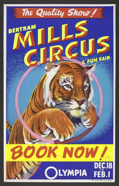
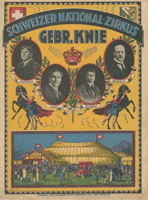
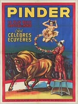
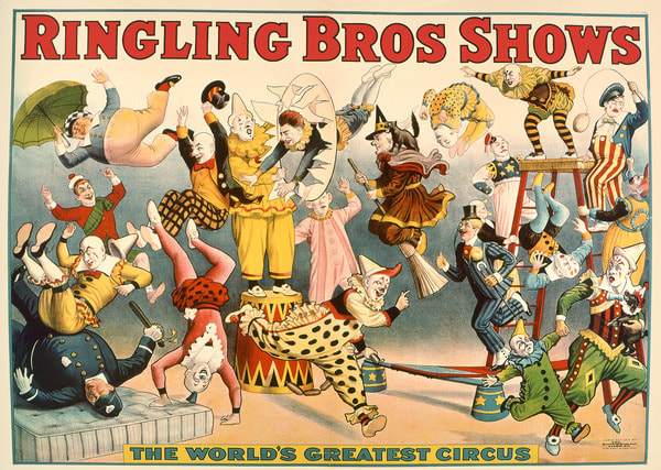
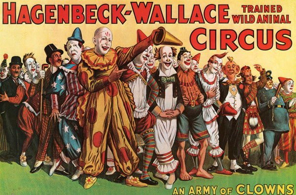
To begin my research I started by looking at vintage posters that advertised various circuses from around the world. The first thing that I noticed about these was the colour palettes used for each one. The is a lot of use of the primary colours; whilst this may have been partly due to the cost on ink at the time that they were printed, I think that this helps to give them definition and helps them stand out against the probably in comparison, dark or dull coloured wall they would have been posted on.
As well as this, I feel like each of the posters would have drawn in an audience purely because they appear to be so busy and full of life. As you can see, they often show multiple activities and parts of the shows. With this in combination with the bright colours and costumes, it is easy to see how people would thing that it would be worth their money to go and see the circus.
Out of the images in the gallery below, I am particularly fascinated with the poster advertising the 'Ringling Bros Shows'. I feel like this is because of a number of things. Firstly, because there is so much implied movement and action throughout the image; from the range of activities that appear to be integrated into the image from the acrobats performing to the running clowns. There is so much going on within this image that I almost feel as if I don't know where to look or what should be the point of focus and attention. However, the bold, red, title of "Ringling Bros Shows" positioned at the top of the image is by far the most eye catching point of the piece because it stands out so much from the rest of the comparatively delicate design of the poster.
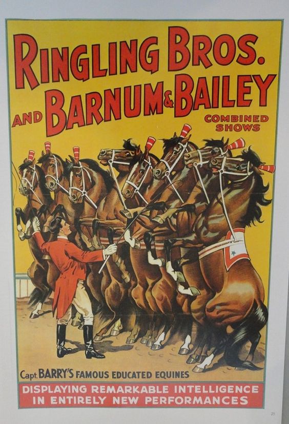
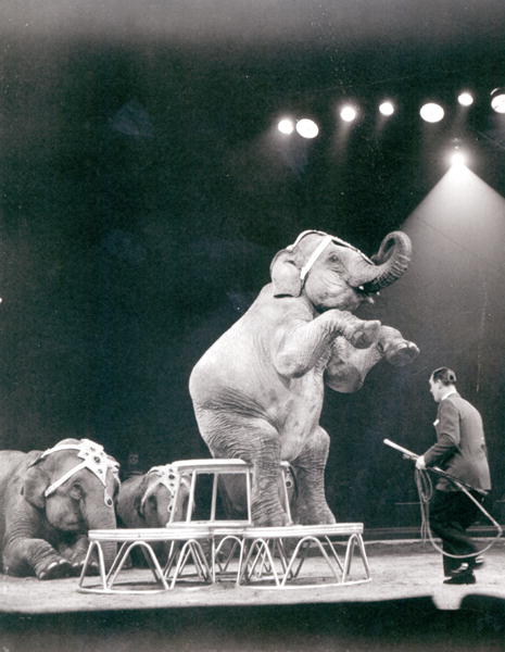
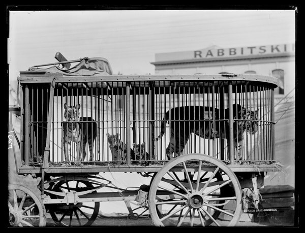
Another element that I find very interesting about the circus is how it used to be acceptable to use 'tame' wild animals within a performance. Obviously now the use of such acts have been banned in many countries due to the cruel conditions in which the animals were kept and treated however this wasn't always the case and animals such as elephants, tigers and monkeys were common sights at such an event. Having done some research into this topic specifically, I have found that the animals were often dressed up and decorated to make them appear either more human like (in the case of monkeys) or simply just more aesthetically pleasing for the audience, often adorning them in colourful and sparkly material to help them stand out from the rest of the circus. These animals were often the main attractions of the circuses. In a time before air travel was affordable or even invented, it would have only been an extremely small proportion of people who would have been well enough travelled to have seen these animals in their country of origin; therefore making the specific circus a possible once in a life time experience to see this animals first hand.
Film Research:
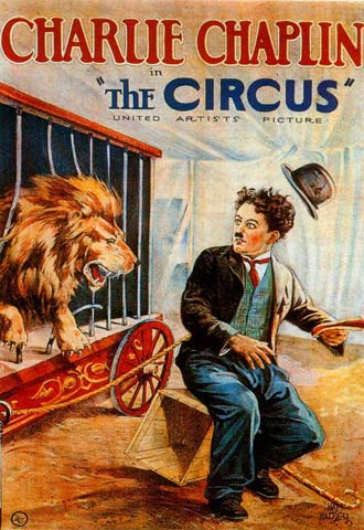
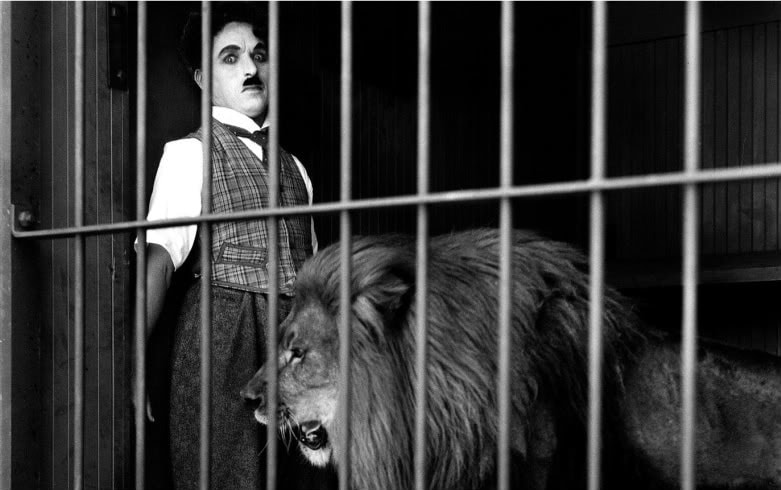
The Circus (1928) - Directed by Charlie Chaplin

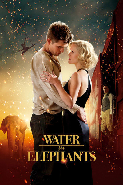
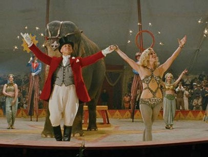
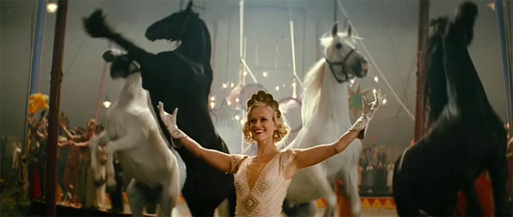
Water For Elephants (2011) - Directed by Francis Lawrence
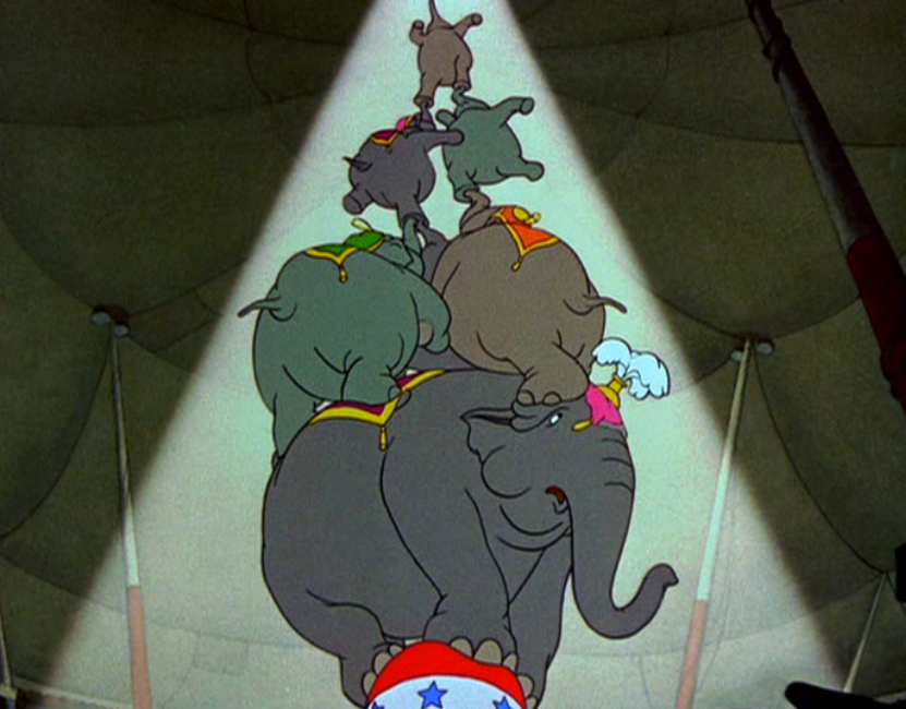
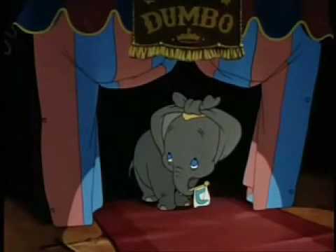
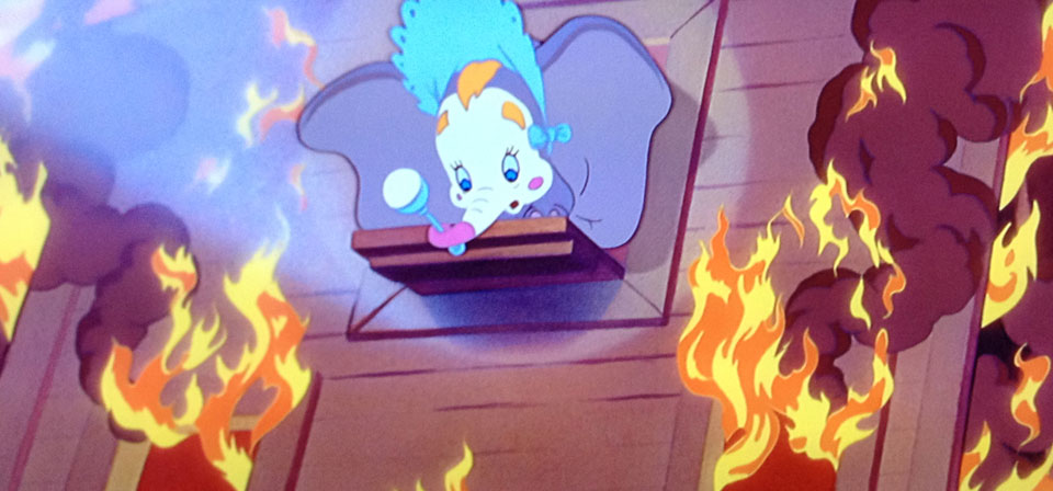
Dumbo (1942)
Books:
British Circus Life - Lady Eleanor Smith
A History of the Circus: The Greatest Shows on Earth - Linda Simon
Circus: A World History - Rupert Coft-Cooke & Peter Cotes
British Circus Life - Lady Eleanor Smith
A History of the Circus: The Greatest Shows on Earth - Linda Simon
Circus: A World History - Rupert Coft-Cooke & Peter Cotes
Initial Sketchbook Work:
Trip To The Circus:
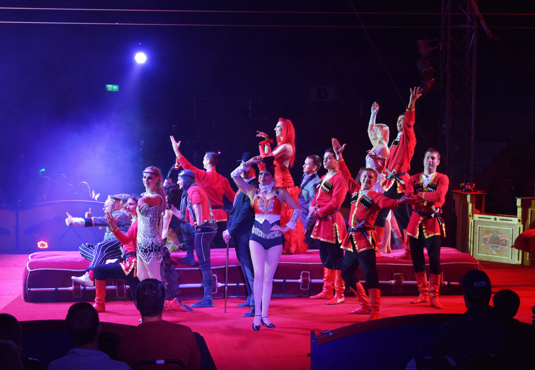
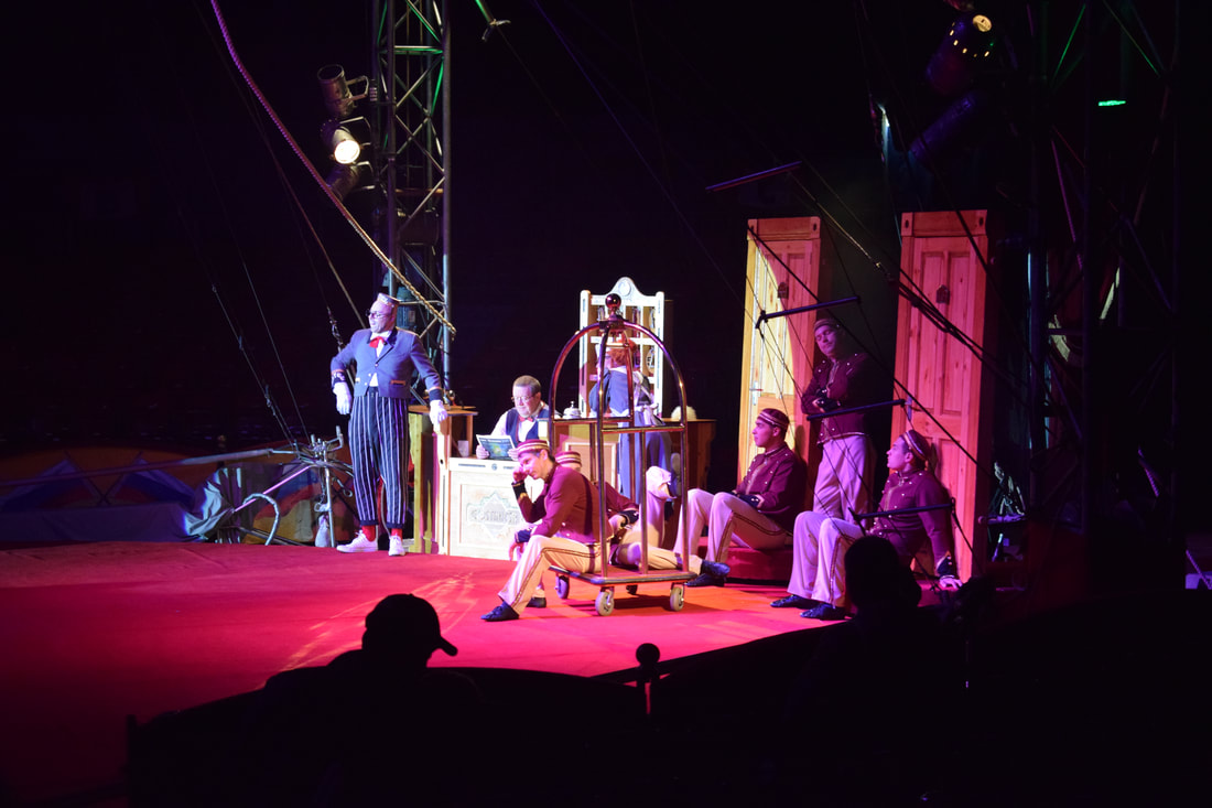
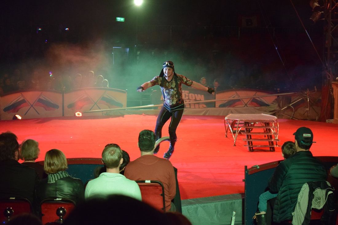
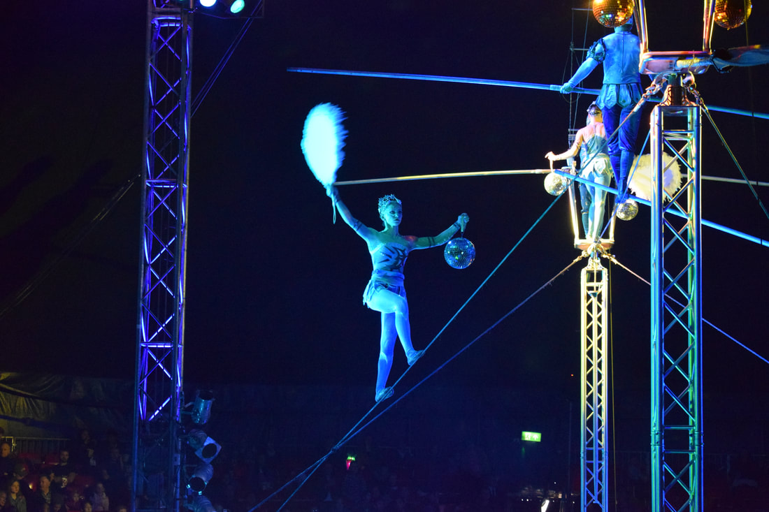
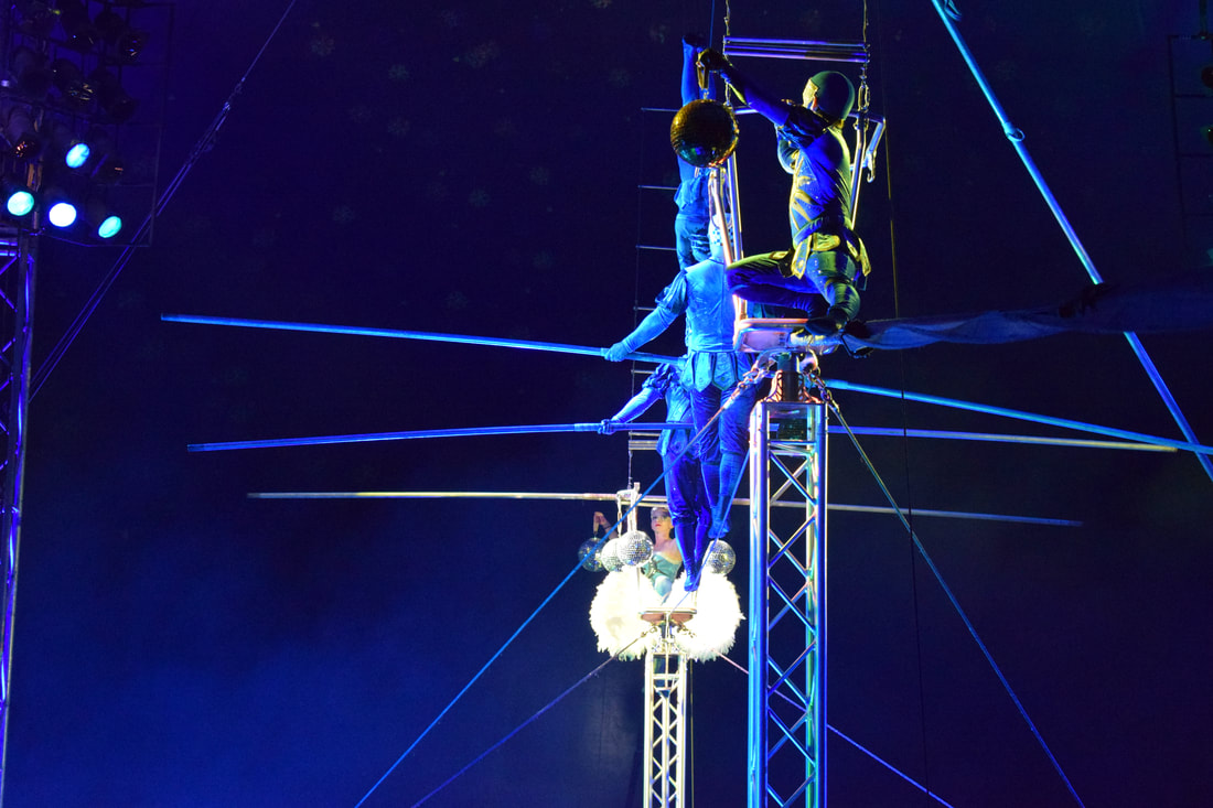
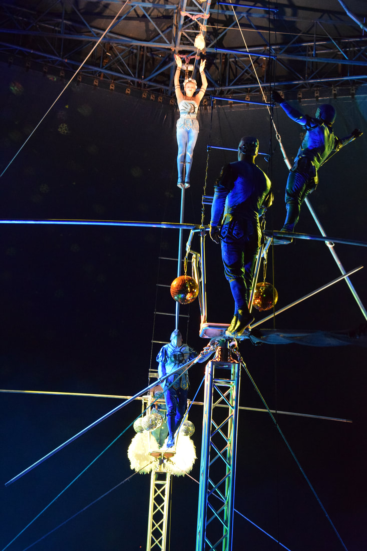
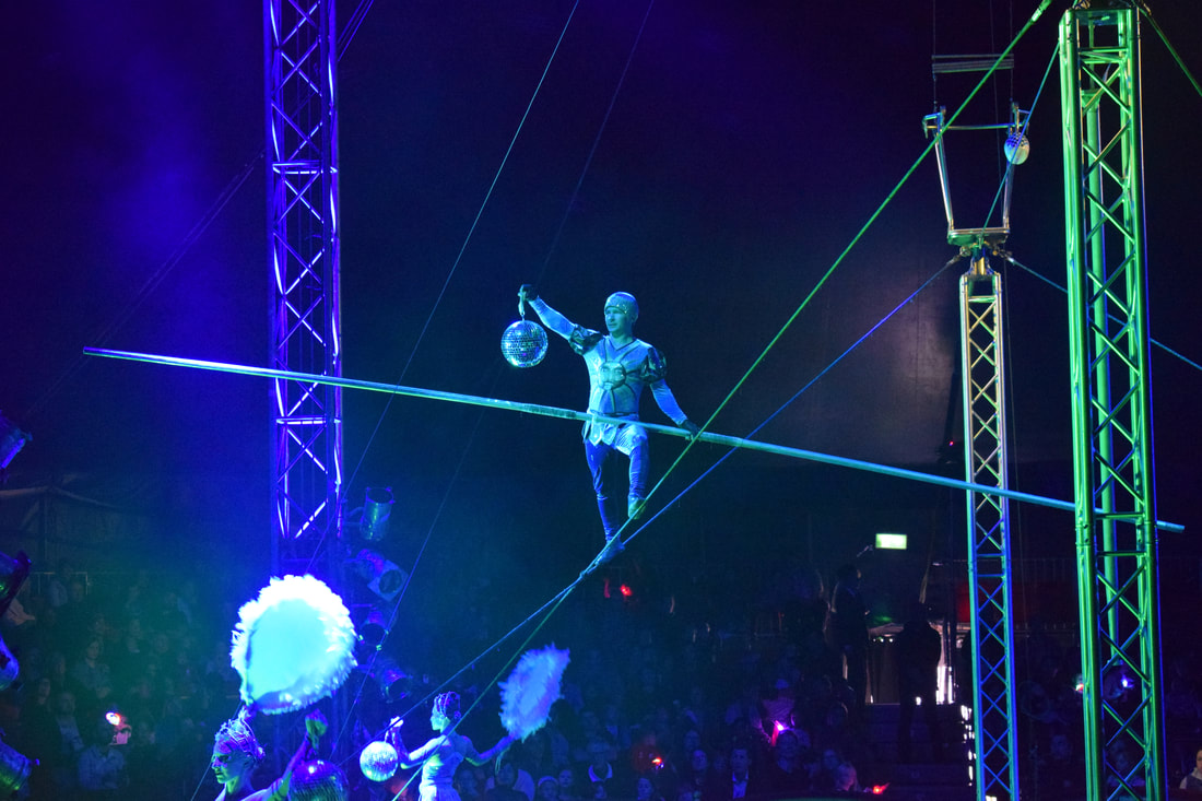
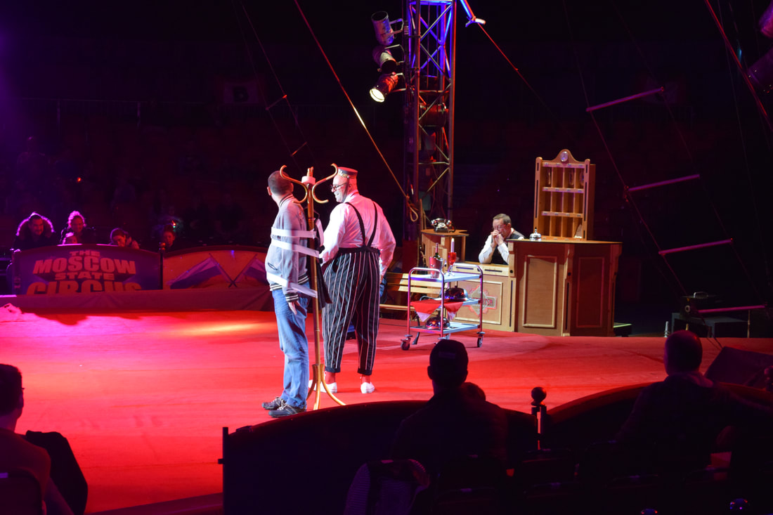
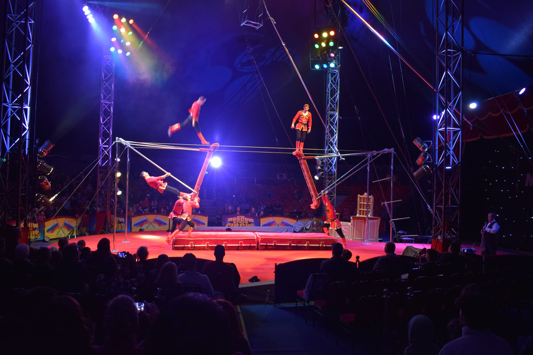
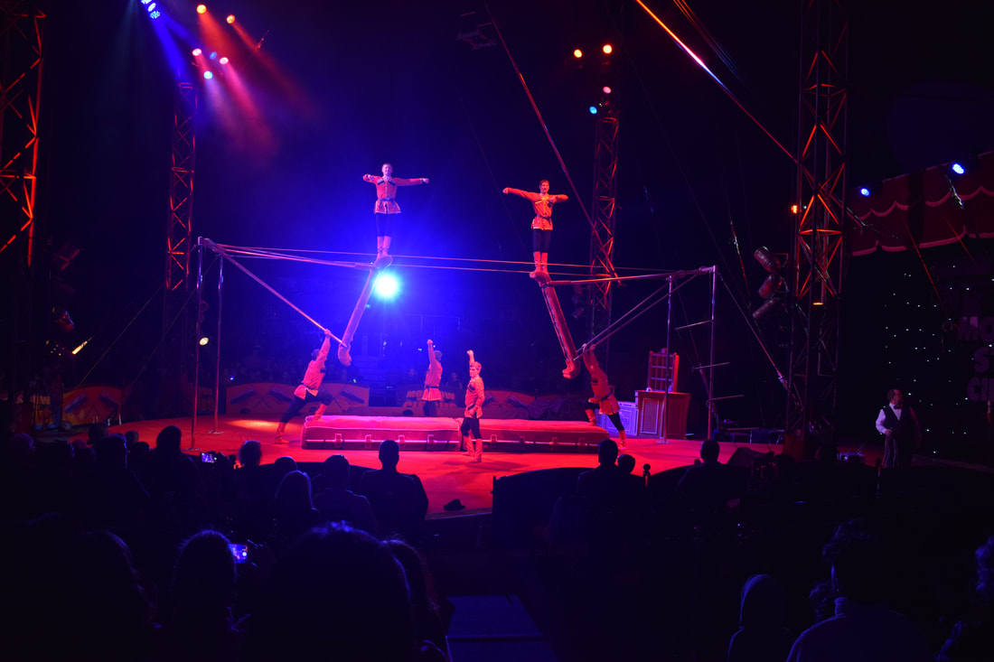
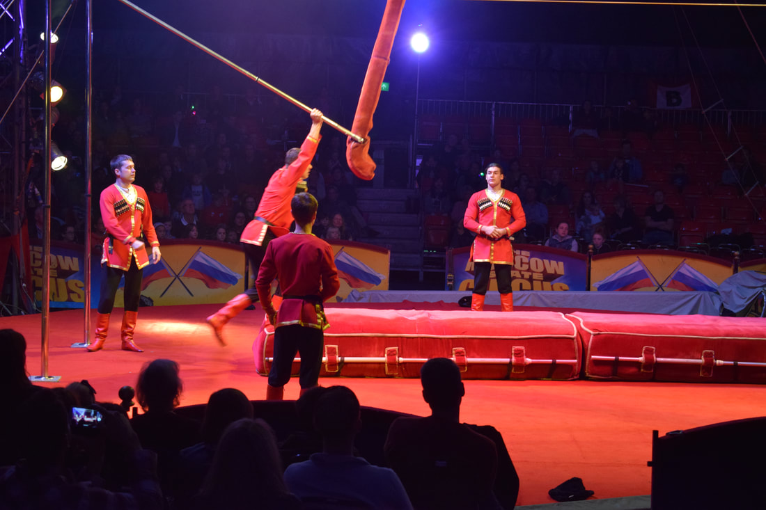
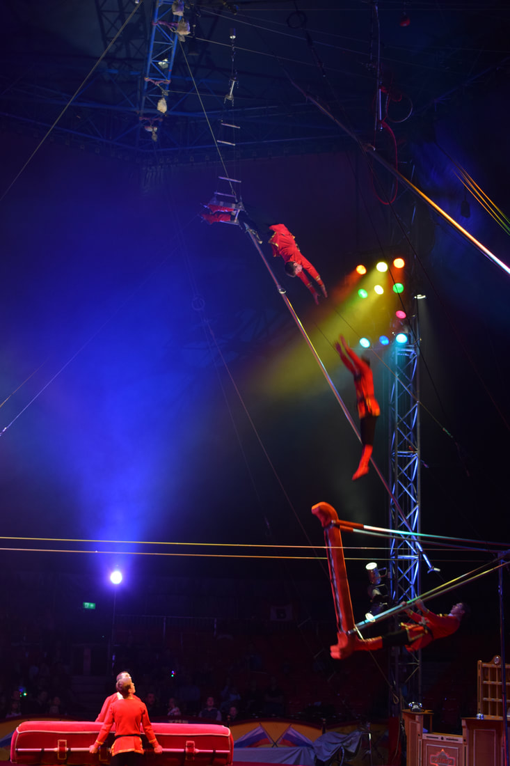
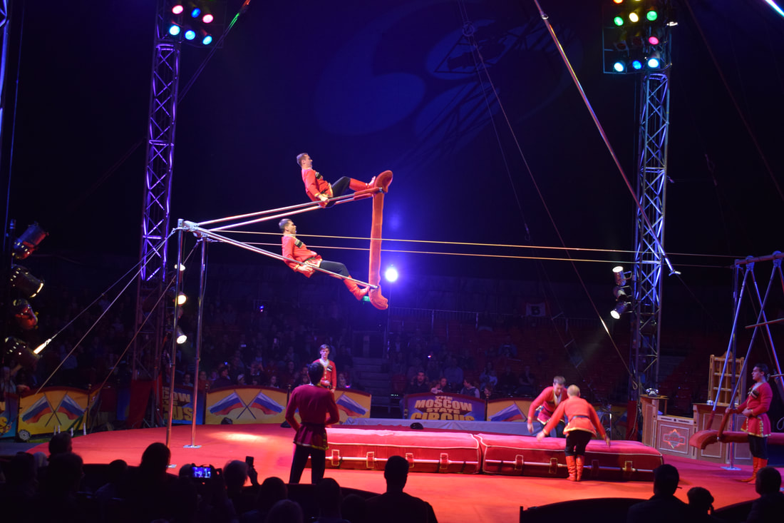
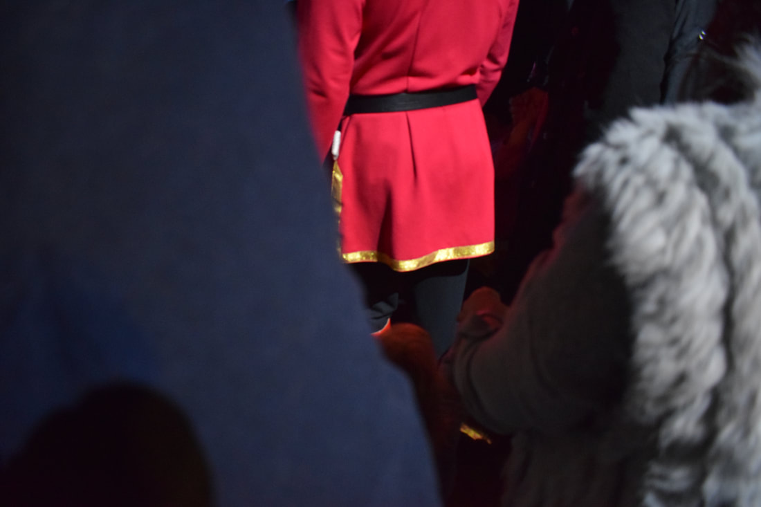
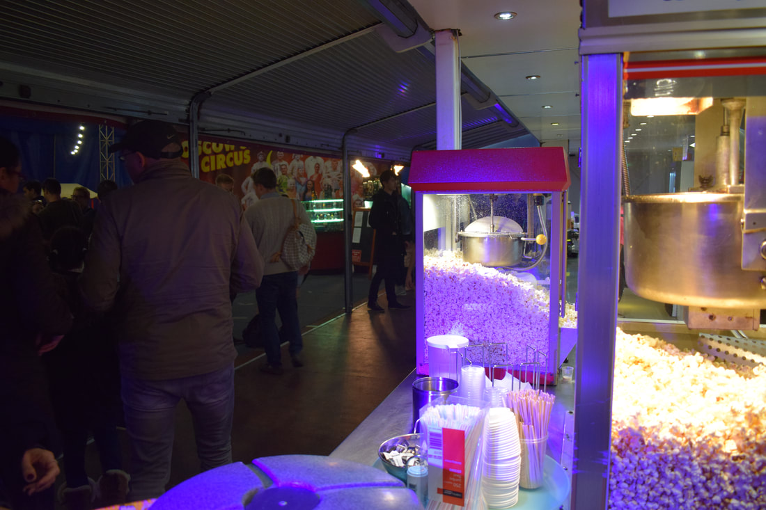
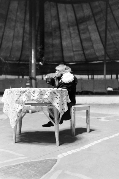
On Saturday 21st October, I took a trip to see the Moscow State Circus whilst they were at Eel Brook Common, Fulham, London. The performance was largely based around acrobatics and gymnastic performances although there were some 'clown-like' characters and other stunts however they were missing some other 'key' characters such as the ring master within the show that I had previously felt helped to define what a circus was. I felt very inspired by the use of colour in the show; predominantly the use of and combination of red and black. It made a statement, making each individual stand out and yet look in conjunction with the rest of the acts.
In addition to this, I was also captured by the sounds and the smells of the circus. One of the first things that I noticed when I entered the tent was the warming smell of the popcorn that took pride of place on the kiosks, lit up by spotlights drawing attention to the food. The other was the obvious excitement; especially from the younger of the audience who were there. Fast talking, children running around in circles and the regular scream from one who was over excited gave the circus an atmosphere unlike any other I have experienced.
In addition to this, I was also captured by the sounds and the smells of the circus. One of the first things that I noticed when I entered the tent was the warming smell of the popcorn that took pride of place on the kiosks, lit up by spotlights drawing attention to the food. The other was the obvious excitement; especially from the younger of the audience who were there. Fast talking, children running around in circles and the regular scream from one who was over excited gave the circus an atmosphere unlike any other I have experienced.
Continuation of the Project:
Having had two tutorials by this point in the project, I decided that I would move away from the usual 'traditional' view of the circus. I began to look at how celebrities and famous personalities could be viewed as different roles in the circus and how these represented different things to make them so appealing. For example; generally, on most vintage posters and in many films the is almost always an image of a beautiful woman balancing on the back of a running horse. This makes the figure seem godlike and angelic - something as humans everyone would aspire to be like making more and more people want to view the spectacle. However, this quickly turned from celebrities to politicians - I think this may be because of the extremely unsettled climates around the world giving me a lot of ammunition to work with. I started with Boris Johnson; extremely well known for his 'stunts' and also recognisable. I then looked at Kim Jong Un and also Donald Trump.
I began by presenting Boris Johnson as a performer who was about to jump from a height into a shallow pool way below him. However, having visited the circus previously, I decided to change this and show him on a unicycle; this being a nod towards his 'Boris Bike' days and that he always looks a little unsteady in both his demeanour and political career.
I really wanted to draw someone being shot out of a cannon; there is something dangerous and yet appealing about this act and I felt that there was only one person who we would all like to be shot out of a cannon. Kim Jong Un. Notorious and possibly slightly insane, he is renowned for threatening to blow up various countries including the United States and I therefore thought this would be the perfect act for him.
At this point in the project I decided to look more about typography and the type of type that was used on the traditional posters advertising the circus to help make these character appear to be more authentic. I usually try to avoid writing and typography or anything to do with lettering however, I felt like this was essential to the aesthetic of the project. I was surprised at how well this went however, it was extremely time consuming. Out of the different styles I have done, my favourite typeface is the one that accompanies King Jong Un. I feel that even just by looking at the style of each individual letter you can immediately tell what it would be associated with. The circus.
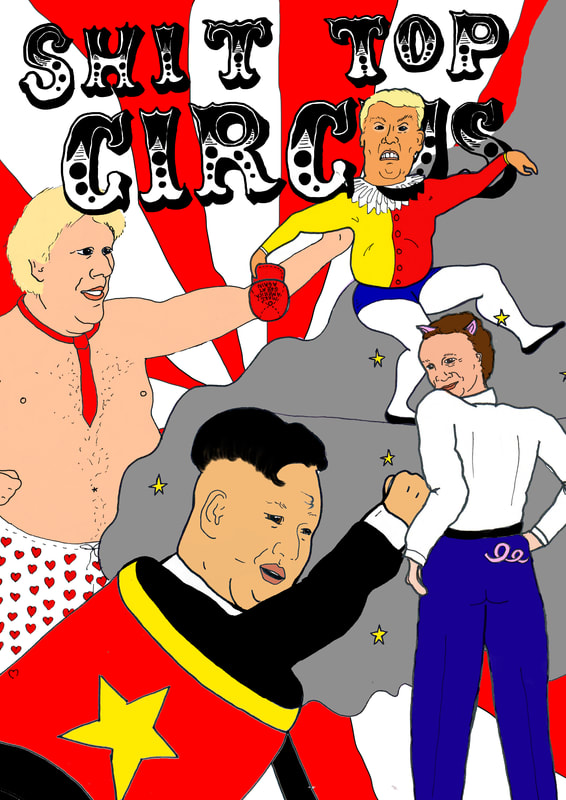
Above is one composition for the poster that would be advertising the circus. I scanned in all of the images I had drawn previously and coloured them on Photoshop. I found this method slightly easier in terms of the composition because each component was easier to move around the page in comparison to painting (as I had tried previously with this image and found that I wanted to change the size and composition of the different characters too often to get a finalised painting). The four characters that I chose to create my poster were Kim Jong Un, Boris Johnson, Donald Trump and David Cameron. I feel like I should have used a more current politician instead of Cameron who is non longer PM however, I felt that because of the famous 'pig' story that surrounded him, I could use that as a part of my circus/freakshow.
I tried to keep to a similar colour scheme that I have seen in original examples of Circus promotion posters however, I wanted to make them bolder and brighter as I felt this better reflected the atmosphere of actually visiting the circus. Keeping to the primary colours was a good choice as I feel that it keeps the poster eye catching however, due to the composition, I sometimes found it hard to make the differentiation between different parts of the image so I did have to compromise either on the composition or the colour. The composition above I do feel could be improved. Whilst I wanted a fully, action packed image, I feel like this different parts don't fit quite yet but this could be easily solved by just changing it slightly on photoshop.
I tried to keep to a similar colour scheme that I have seen in original examples of Circus promotion posters however, I wanted to make them bolder and brighter as I felt this better reflected the atmosphere of actually visiting the circus. Keeping to the primary colours was a good choice as I feel that it keeps the poster eye catching however, due to the composition, I sometimes found it hard to make the differentiation between different parts of the image so I did have to compromise either on the composition or the colour. The composition above I do feel could be improved. Whilst I wanted a fully, action packed image, I feel like this different parts don't fit quite yet but this could be easily solved by just changing it slightly on photoshop.
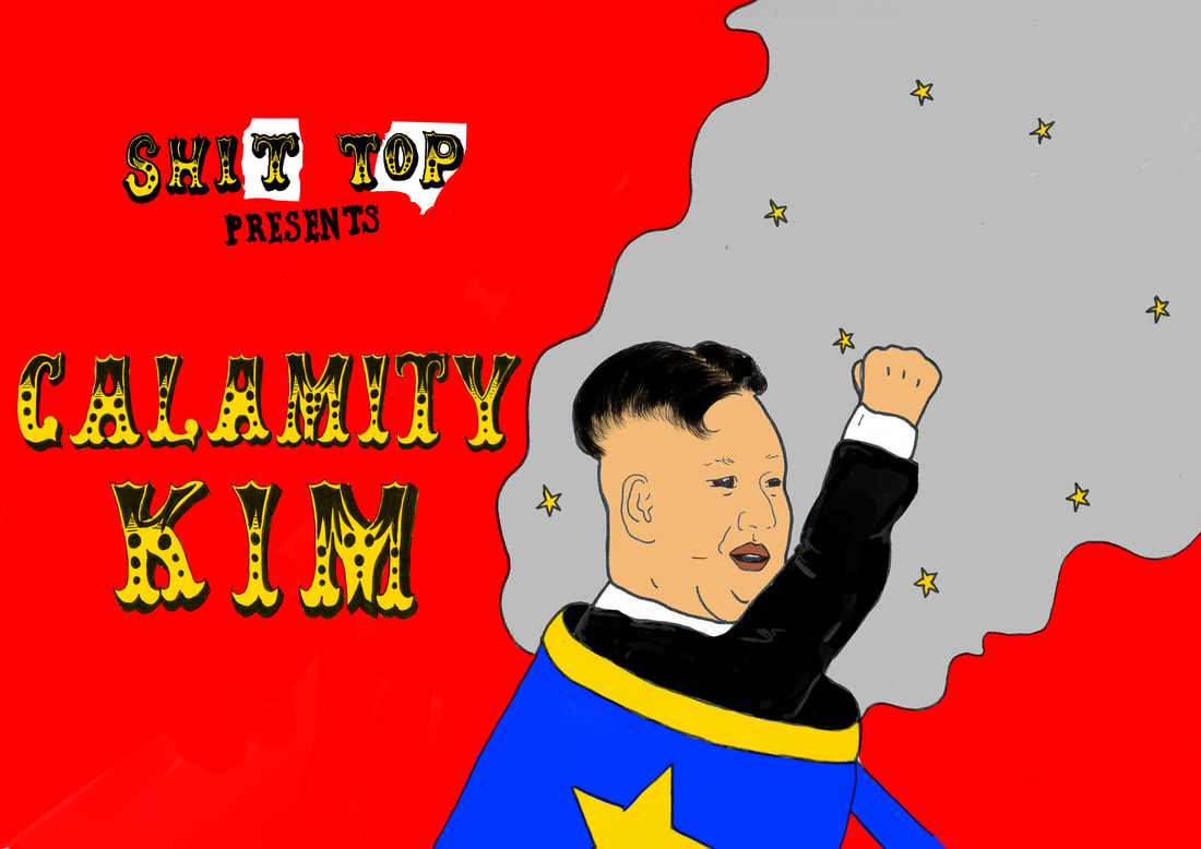
I tried a slightly different approach after the first poster by starting to create posters for each individual character. I thought this could help me to get a better sense of the shape and compositions I could use as well as having more of an opportunity to add typography. I started with Kim as I already had drawn the typography for his act so to save time thought I'd experiment with this first. Like my first poster, I tried to stick to the primary colours; this was much easier with having just the one character because He doesn't have to stand out against such a busy background so it is much clearer what his act is. Because of this I think this poster is much more 'punchy' than the other and would definitely be more likely to catch your interest. I liked the red background; especially in contrast with the yellow and black type. I enjoyed the typography much more than I thought I would have. Whilst it was time consuming, and at times very frustrating; I feel like that because this is something that I have never done before/tried to avoid with my life at all costs, it really paid off.
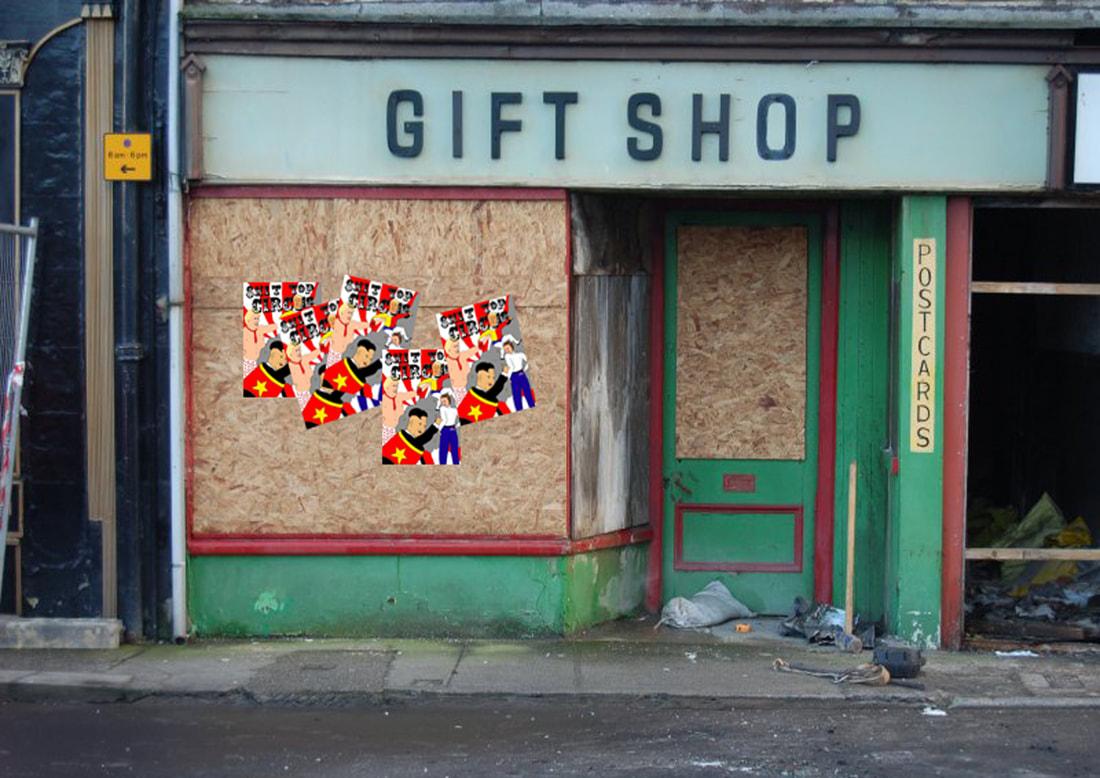
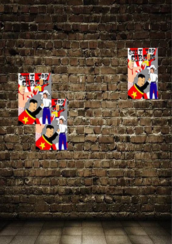
I decided to mock up how these posters may look if they were posted in different places. I imagined them being posted down a dark alley and being long forgotten about, or left tied to a lamppost to face the elements. I found images of different places where the posters could have been stuck and used Photoshop to create mock ups of how they would look in these places.