The Manifesto project was a collaborative project. I worked along side Ellen Rose, a combination that I felt worked really well as whilst we both have own own styles and ways of working, we had similar ideas about what we intended to do initially and were prepared to cooperate and combine our work together.
To start we decided to write down anything and everything that we could think of to do with the project. This worked well for us as a way to kick off as we could both see what any initial thoughts or ideas were without being overpowered by the other person and making sure that we were both on the ball with the project. From this came the theme of our manifesto - 'An end to sexist advertisement against women'.
We wanted to throw every idea we had at it - from using existing advertisements to creating our own...basically any way to get our point across. Our initial idea's included creating collages from adverts, lipstick marks, scanned in items (stereotypically 'female'), different textures and sketches and drawings. Also by this end of this stage we knew that we wanted to make a 'zine' - something that was small but punchy.
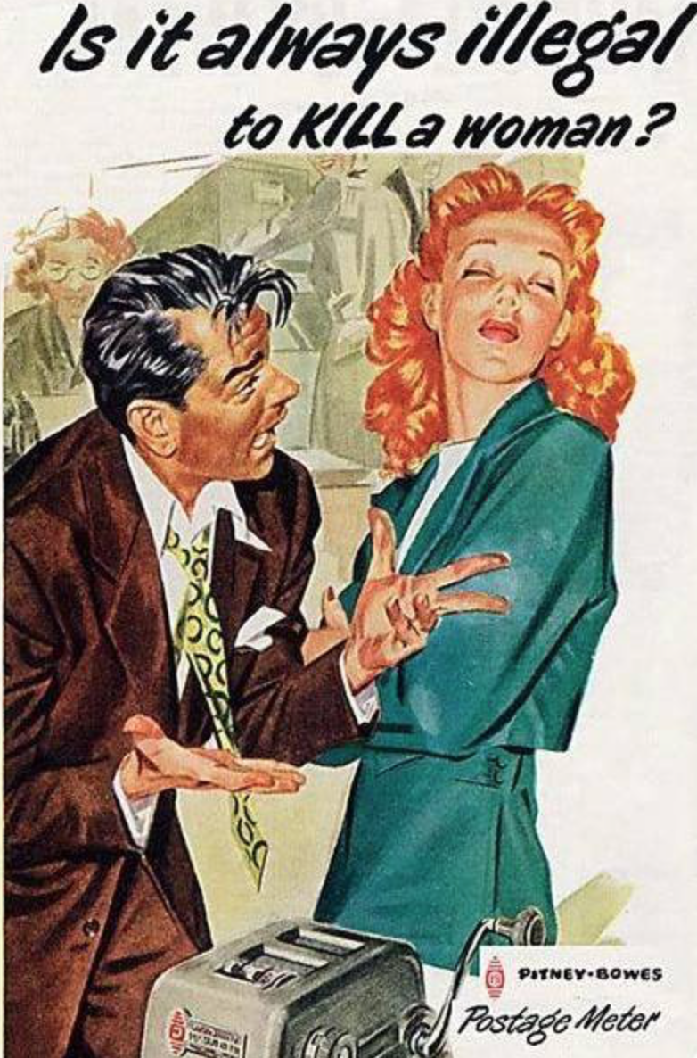
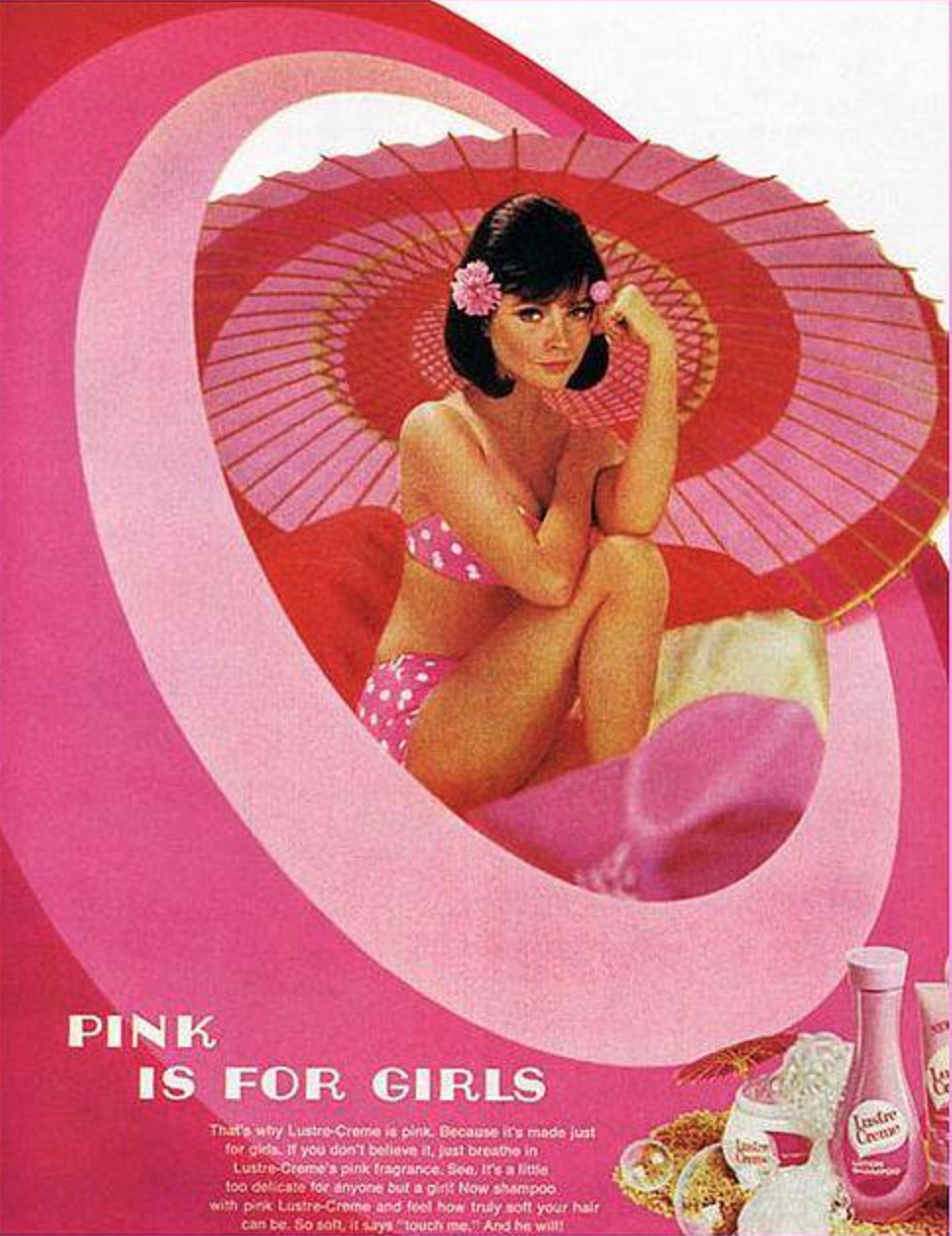
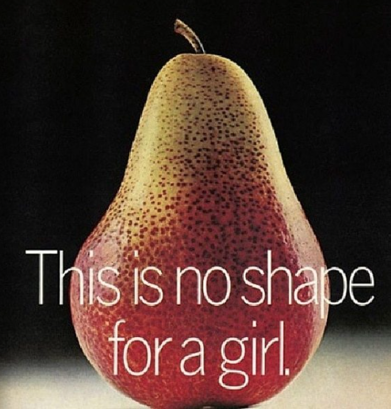
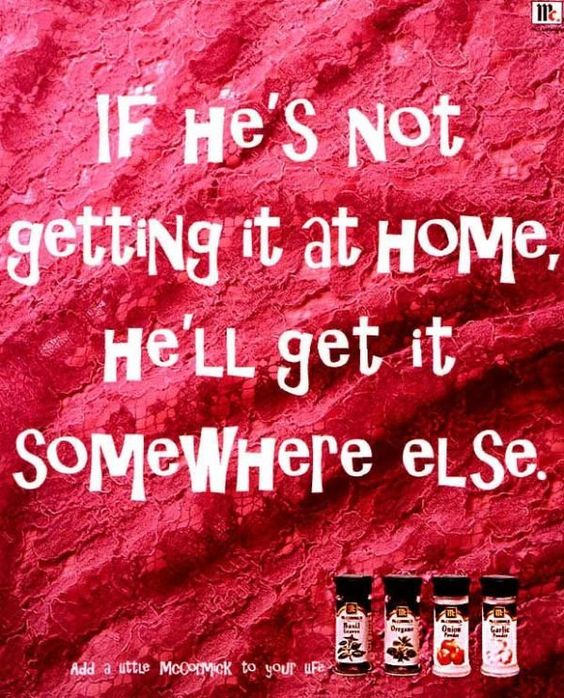
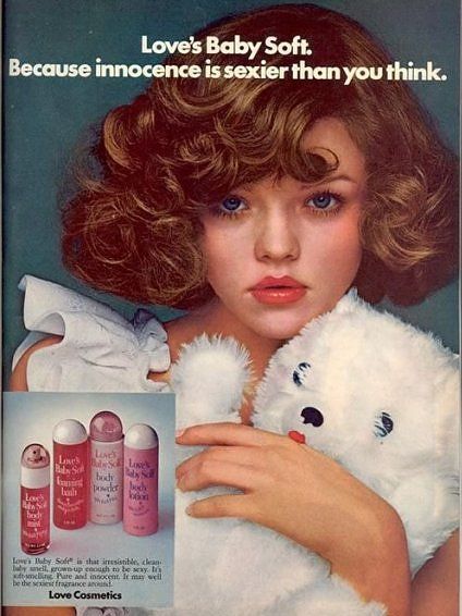
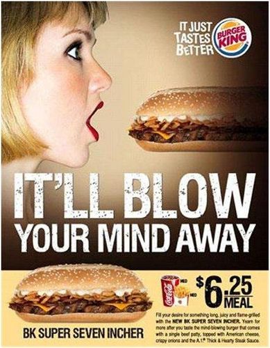
Having got to this point in the project we needed to start creating the content of the zine. We set ourselves each a target of 15 single pages so that we could then pick and choose which went together well and which would be included (or as the case may be, not included) in the zine. Together, we scoured the internet and magazines in the library to find examples of this sexist advertisement. below are just some of the examples that we came across...
Choosing which ones we wanted to work with, we then each went our separate ways to begin to create the pages. We did, however, keep in close contact whilst we were working individually as we wanted to make sure that the zines pages would fit together nicely and the images wouldn't look to displaced if they were put next to each other. We continuously checked in and talked about ideas and how we could improve the images we had sent to each other to keep the ideas looking fresh and not too tired.
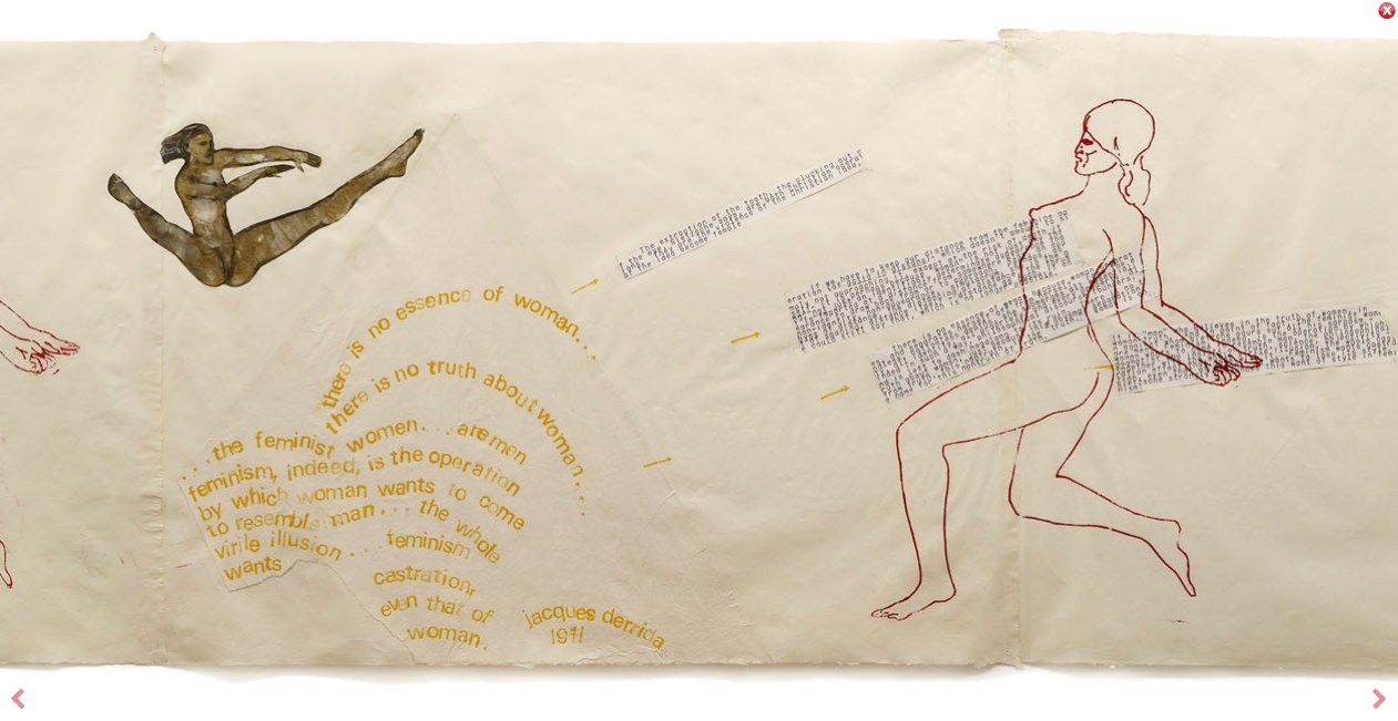
The image above is by an artist called Nancy Spero whom we came across whilst researching for the project. Spero had a great political and social presence within her work which was communicated through a combination of collages and hand drawn work. Specifically in this image, we admired how Spero had layered the type under the drawing and in addition to this, how the yellow typeface greater curved shapes which contrasted with the dark, linear type on the right hand side of the image.
As well as using physical techniques to create our collages (such as cutting up, sticking down, arranging and re-arranging) we also decided to use digital techniques. This was because we wanted to enforce that sexist advertisement is still very much a current and pressing issue. We looked at recent news articles that we were already familiar with that cover the issues and the reactions to them.
https://www.theguardian.com/media/2015/apr/27/mass-demonstration-planned-over-beach-body-ready-tube-advert
http://www.standard.co.uk/lifestyle/london-life/sexist-spa-ad-on-london-underground-sparks-backlash-on-twitter-a3485941.html
I addition to this, we also researched the 'Punk' movement, what it stood for and what it symbolised.
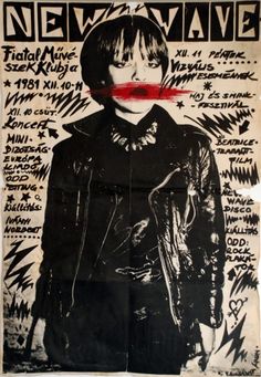
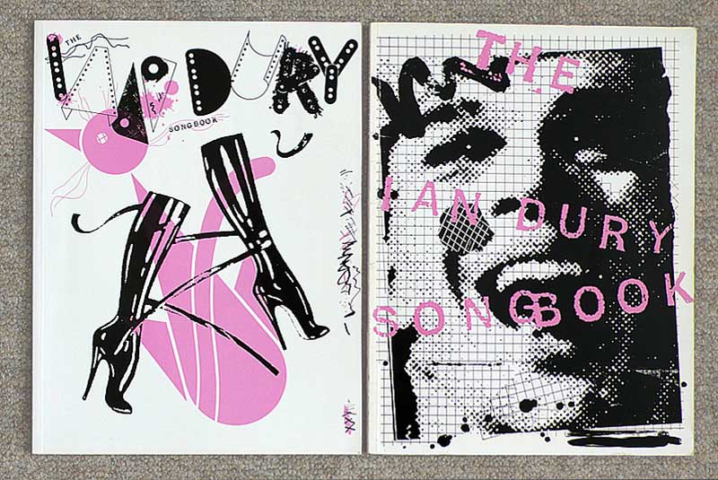
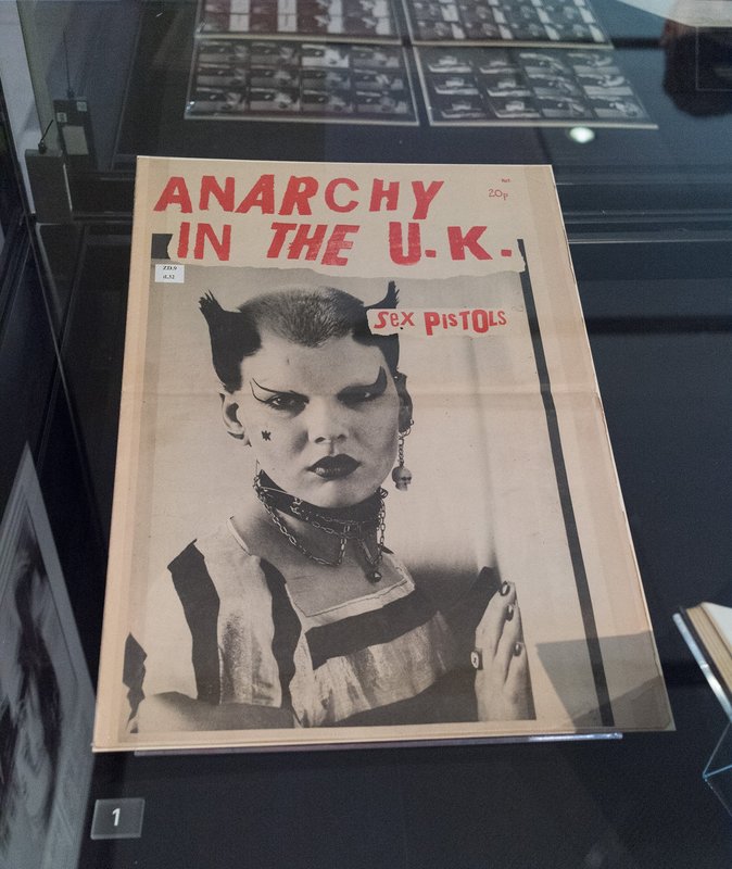
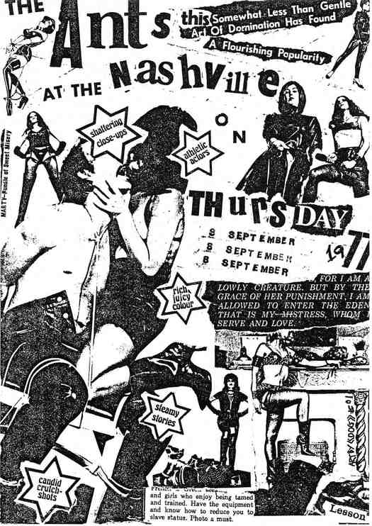
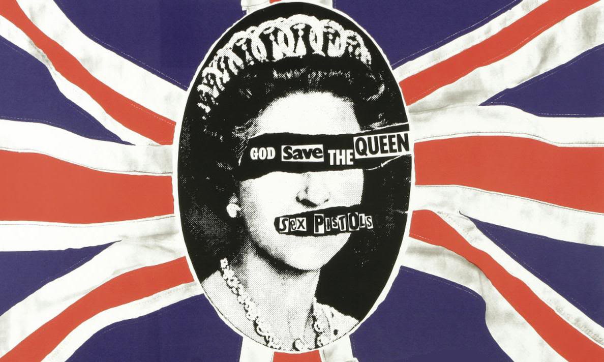
This research definitely influenced both the style and layout that we ended up using within our zine pages. The cut and paste style was something that we felt really grabbed attention along with using a combination of typefaces and hand written text.
We created a PDF file (below) once we had decided on which order the pages should be in and made any last minute changes to the images. We found that a few of our pages were not of a high enough quality so appeared very pixilated when enlarged for the page and this was one of the deciding factors in deciding what should and shouldn't be included in the zine.
We created a PDF file (below) once we had decided on which order the pages should be in and made any last minute changes to the images. We found that a few of our pages were not of a high enough quality so appeared very pixilated when enlarged for the page and this was one of the deciding factors in deciding what should and shouldn't be included in the zine.
| compressed_final-zine_2.pdf |
