
For this project, I started off with a very wide range of ideas and the first challenge I faced was trying to simply focus on one of them. I thought about different memories that I had about various parts of my life, whether it was a school event, a birthday or trip, I wanted to explore what ideas I had to work with. One of the main contenders was looking at the number of bones I had broken and of my memories of various injuries I have accumulated over the years. However, I wanted to be able to think about evoking particular feelings and emotions about where the memories were and I felt that it could be a fairly negative feeling project if I were to focus on time spent in hospital. After this I thought about trips that I had made and holidays I had taken. These included skiing in Italy, surfing in France and Morocco, visiting New York and travelling around Germany. Whilst all of these times held great memories for me, I felt like I wanted to focus on when I was solo travelling in Germany as it had both high and low points whilst I felt could give it some depth and interesting views when focused in on.
I made a list of all of the places I went to and things I did whilst I was travelling round the country. This was so that I could focus in on a particular event or place as otherwise I would end up feeling quite overwhelmed by the project.
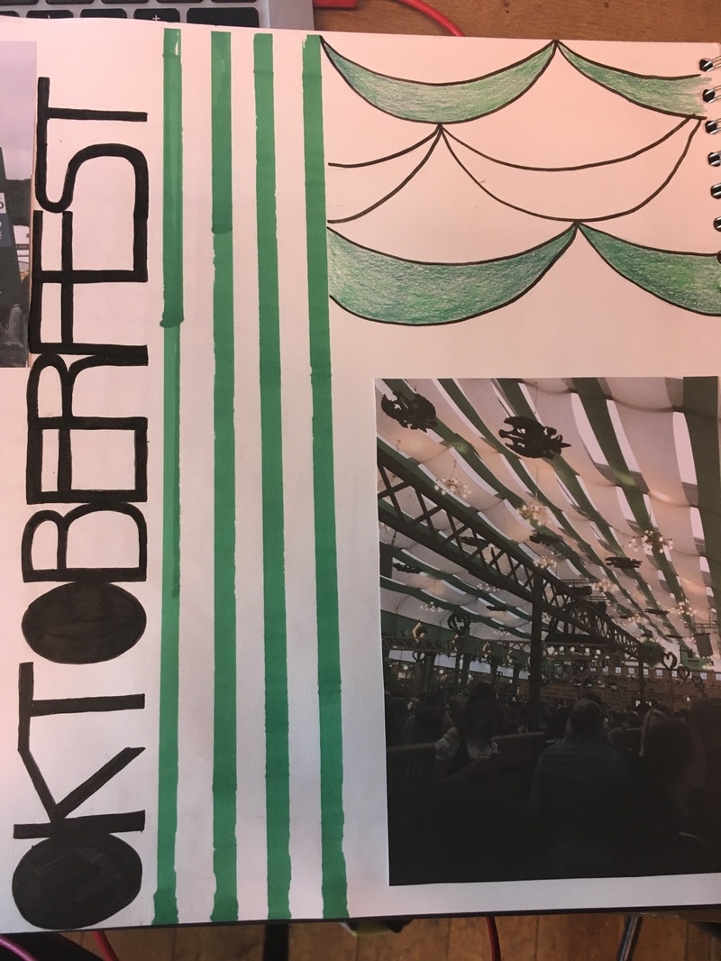
I chose to use my memories from when I stayed in Munich - specifically those from Oktoberfest. Another reason why I chose these memories is because I knew I had a lot of research material on the festival and I had also taken many photos whilst I was experiencing it. I felt this would help as I could work from my own images when creating work rather than having to make everything up or using found sources.
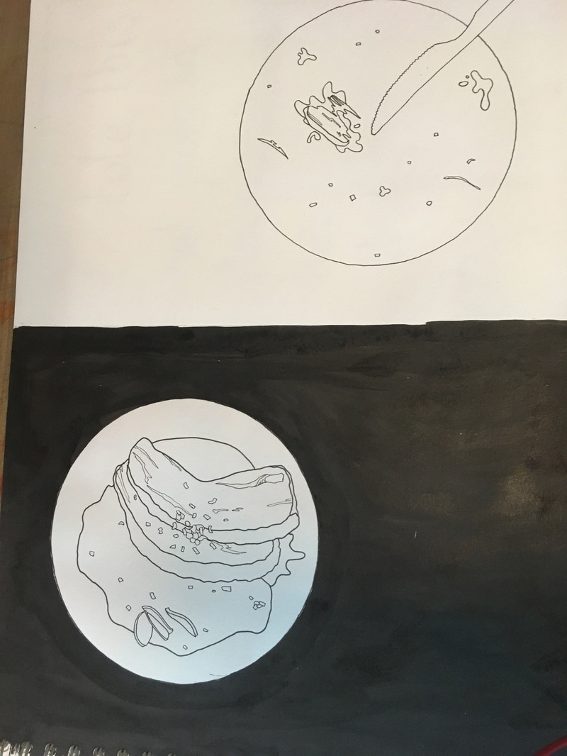
I made a mind map of all of the different elements I could think of that the festival was made up of, looking at all five senses - touch, sound, sight, taste and hearing. The mind map quickly grew and quickly involved everything from Hendl and Schweinbraten to Dirndl, the security measures and the fun fair.
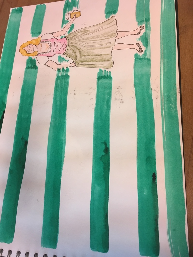
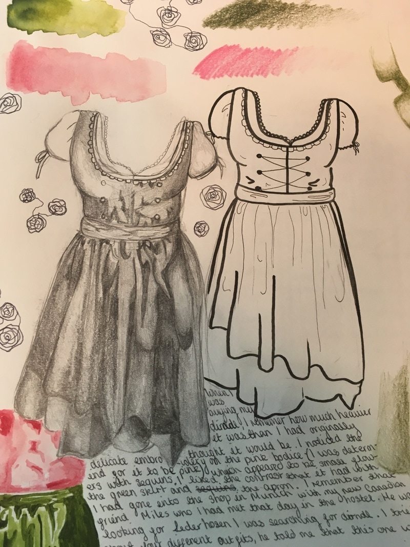
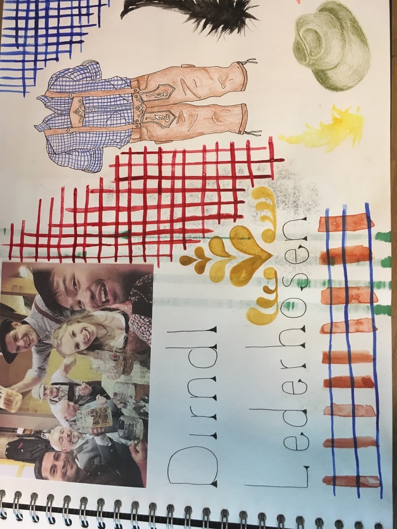
After this, I used my own photos to kick start some research and to help me explore some initial ideas into what memories I had of when the images were taken. I started with the first time I had worn traditional Bavarian dirndl. I wrote the specific memory down on the page along with my own interpretation of the photographs. I then used images to think about the traditional Lederhosen and what memories this evoked.
I remembered the first time I waled through the entrance to the festival and not knowing what quite to expect. There was a massive feeling of uncertainty for myself but everything was so certain within the fences. Everyone seemed to know exactly what they were doing and how they were going to go about it. I remember thinking that you must have to pretend you're confident, even if you're not. So I wanted to try and convey a very solid sense of being and confidence into my work through bright colours, solid outlines and text.
I made a list of all of the places I went to and things I did whilst I was travelling round the country. This was so that I could focus in on a particular event or place as otherwise I would end up feeling quite overwhelmed by the project.
I chose to use my memories from when I stayed in Munich - specifically those from Oktoberfest. Another reason why I chose these memories is because I knew I had a lot of research material on the festival and I had also taken many photos whilst I was experiencing it. I felt this would help as I could work from my own images when creating work rather than having to make everything up or using found sources.
I made a mind map of all of the different elements I could think of that the festival was made up of, looking at all five senses - touch, sound, sight, taste and hearing. The mind map quickly grew and quickly involved everything from Hendl and Schweinbraten to Dirndl, the security measures and the fun fair.
After this, I used my own photos to kick start some research and to help me explore some initial ideas into what memories I had of when the images were taken. I started with the first time I had worn traditional Bavarian dirndl. I wrote the specific memory down on the page along with my own interpretation of the photographs. I then used images to think about the traditional Lederhosen and what memories this evoked.
I remembered the first time I waled through the entrance to the festival and not knowing what quite to expect. There was a massive feeling of uncertainty for myself but everything was so certain within the fences. Everyone seemed to know exactly what they were doing and how they were going to go about it. I remember thinking that you must have to pretend you're confident, even if you're not. So I wanted to try and convey a very solid sense of being and confidence into my work through bright colours, solid outlines and text.
I carried on looking through my own photographs and recording the memories behind them. I liked how I could combine the text and the image to recreate a memory on paper. I don't usually use much typography within my work so this was a nice change and has helped me to get some practise at using typography within my work. Wanting to continue with this form of work, I began to tell each memory from a first person perspective with text that would be set around an image as if it was totally immersed within the memory. I wanted to experiment with working in only one or two colours to create a contrast between the different elements of the image as well as keeping the viewer at a distance from a memory that isn't their own.
I feel like I began to focus on portraits of people from my memories and of myself from the memories as they are definitely the common theme from all of my memories. It was definitely the people that I made the memories with that influenced every other memory that I have of the time I had whilst in Munich. This is something that I'd really like to enforce within my work.
I feel like I began to focus on portraits of people from my memories and of myself from the memories as they are definitely the common theme from all of my memories. It was definitely the people that I made the memories with that influenced every other memory that I have of the time I had whilst in Munich. This is something that I'd really like to enforce within my work.
I made the conscious decision to try and keep the memories as simple and to the point as possible; not only though the drawing but also the typography and the subject of the text. I wanted to keep it quite "matter of factly" sounding as that is how I remember the moment itself. I feel like keeping the letterforms fairly simple and keeping them looking as if they have been handwritten as it makes the 'memory' look and feel more personal to me as it has my own personal handwriting incorporated into it.

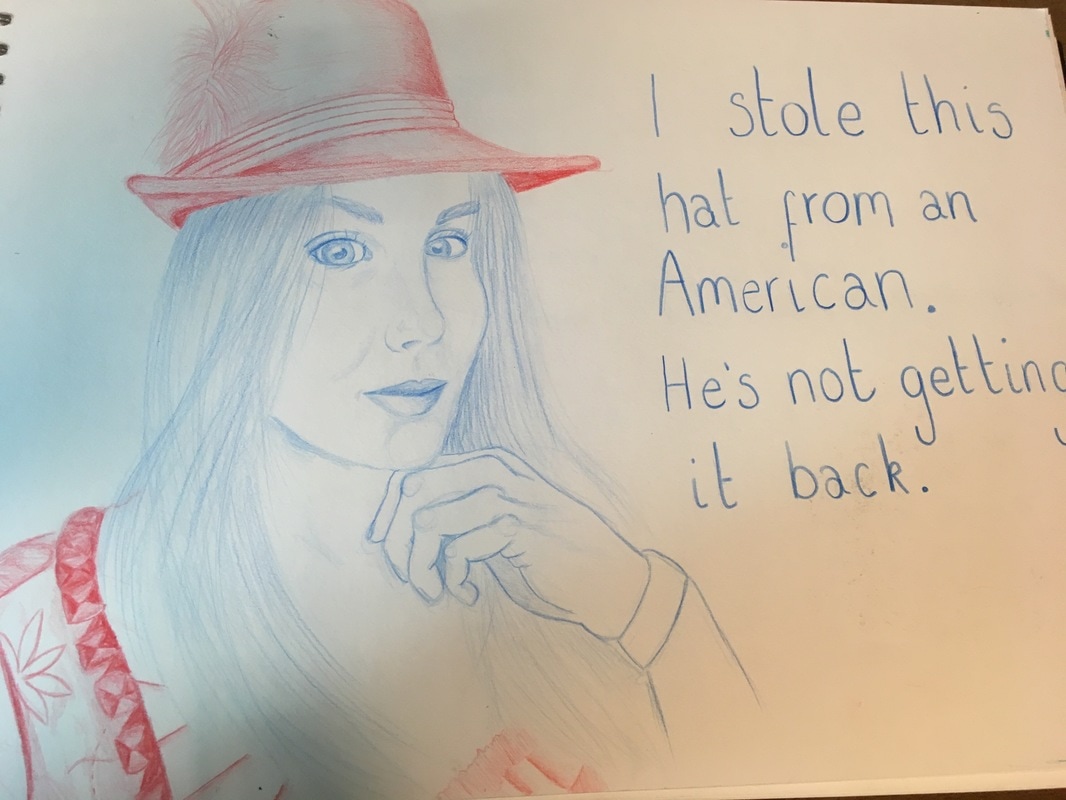
Having made a few examples of the portraits using limited colour, I decided to make a semi finalised idea for the vertical project. Knowing that I wanted to focus on the people in my memories of Oktoberfest made the choosing of what memory in incorporate much easier. I met some very...interesting characters during my time in Germany but this man in particular was one of the most memorable. The American was convicted that I was an Australian, faking my British accent. He told me his 'life story' and how he was a millionaire although there were quite a few holes in his story and I was pretty sure that there had been a fair bit of exaggeration. I think I met more Americans at Oktoberfest than I met Germans, and I remember thinking this was quite strange especially as I could speak fairly good German and the friend whom I were with were also German! I made this initial image in tonal graphite as it was easy to change and rub out if necessary but I think that the final image will be in colour. I really liked the combination of the red and blue colour pencil drawing I had completed earlier and I think the red white and blue could help enforce how "American" this man really was. I have also thought about how I am going to add text within this image. As I have developed these drawings, I have started to add more and more text to make it feel much more immersive. I want this one to be completely surrounded by the typography; looking a little chaotic as I remember the drunken state of my new American friend.
The final image that I have created for this project did use the techniques that I had been using previously in the project. I also kept to the 'red, white and blue' theme to help enforce the effect of his nationality and personality. I did end up taking out some of the text. Whilst I originally wanted it to look very chaotic, it ended up looking like quite a mess before so I decided to settle with just one of my memory quotes from before; "This American was convinced that I was really an Australian" as I felt that it was this memory that really defined how we were introduced and gained our friendship.
I'd like to add to this project in the upcoming months; I think that produced in this way, the idea could work really well as a series of pieces which could then be displayed together or put into some sort of folder or book.
I'd like to add to this project in the upcoming months; I think that produced in this way, the idea could work really well as a series of pieces which could then be displayed together or put into some sort of folder or book.

Serica Bawden used limited colour in this portrait of her mother (below). She used red, green and blue simply to define one face from another so whilst it may look like a bit of a jumble, you can easily see what she has drawn and the different positions they have been drawn on the page. I also like the contrast between the colours, and how they stand out from the grey sketching in the background and the white paper which it has been drawn. This has definitely influenced my use of colour within the project, helping me to make the decision to keep colour uncomplicated and fairly minimal so that each of the parts of the image can be clearly seen and it doesn't simply blend in.

Left, is a photomontage by Joe Webb. I really liked the composition of this piece and how whilst information is missing, it is insinuated through the negative space. I think that this sort of idea could be interesting when combined with typography which could possibly give the rest of the information which is critically missing. However, this has definitely made me think about the use of negative space within my work and how important the composition can really be. I am going to take this into consideration when working from the photographs in this project and how the composition could be modified to involve the text without overcrowding the page in which it was on.
