Starting this project I felt a little lost - there are so many different things and subjects to immerse yourself in it seemed almost impossible to pick simple one. Because of this, I looked back at some old personal work to try and find a reoccurring theme as I don't get to do as much personal work as I used to due to the work load from uni. I already knew that I had a peaking interest in botanics and the detailed studies that have been drawn throughout history. I had used plants and flowers within my work before but now I feel it is really time to enjoy and indulge in a project. I find it interest that as humans, we purposely pick flowers knowing that in a few days they'll die, slowly withering away. There is a fragility in the natural forms of these plants that are hard to really appreciate unless they're stuck in front of you; I'd like to investigate how I could convey this within the nature of my own work looking at the structures and forms in detail and documenting how they change over time.
As well as an interest in the subject, I'd also like to have some more practise with drawing in a more traditional form in comparison to what I have been working with over the past few years.
I have begun my research for this project by looking at 'traditional' botanical illustrations.

|
This illustrated page comes from a 1920's German medical journal. Whilst I can't find out who the illustrator was, I think that the detail is stunning - every part of each of the plants has been paid attention to and carefully documented. Drawing something as to the likes of this will really test how well you look and study the subject whilst drawing it. I also like how the colour appears to be quite muted - whilst this may be partly to do with the age of the book it comes from, it seems to be something that is seen within a fair few botanical illustrations. In addition to this, I find the composition of this page quite intriguing. Whilst it is full of plant studies, there is still enough space for each piece to be seen as an individual study however, looking at the page from a distance, there is a real feeling of intense life.
|

|
This illustration is by Christine Stephenson, an accomplished botanical illustrator. Due to the composition of the page, with the radish being positioned completely in the centre of the page all of the attention of the viewer is focused on the sole study. This example is by far the brightest and has the most vivid colours. And whilst it isn't symmetrical, there is an element of mirroring which appears to be quite charming for a vegetable.
|

|
Frederick Polypore Nodder created this illustration whilst on Captain Cook's voyage to Australia. It was drawn to be life size and was the only way of documenting new plant species to show the rest of the world when it was made in the late 1700's. Not only does this have important historical context, but it is also visually a delicate piece which would have had to have been created within a set amount of time under pressure. Whilst the colours in this piece are not as vivid as the item above, there is a great amount of detail and i think that the different views of the leaves (with some of them twisted and bent in interesting shapes) are visually interesting to look at.
|
|
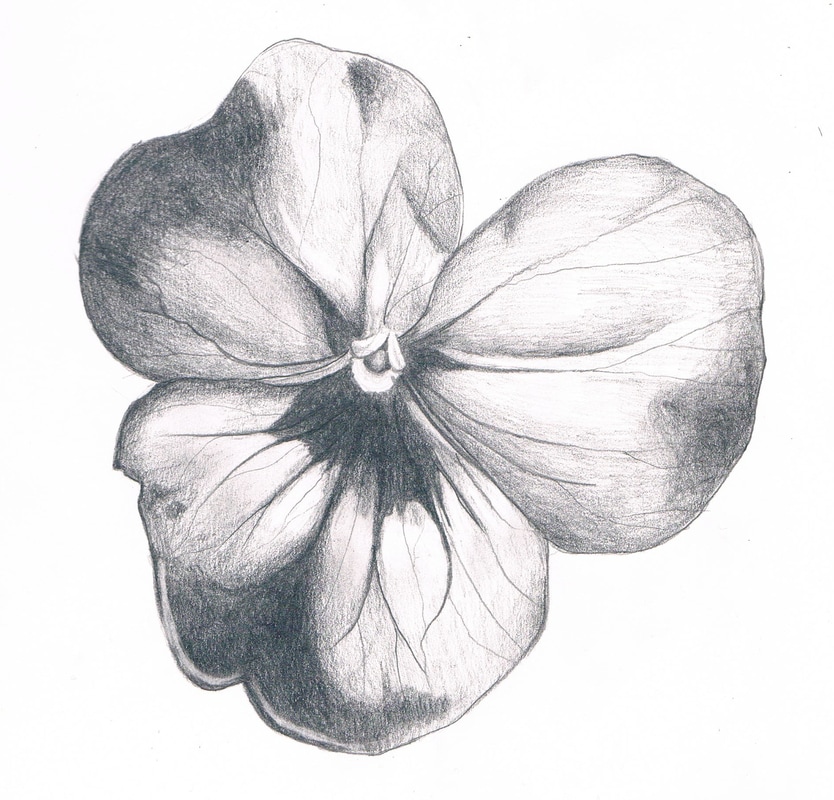
I began with taking photographs of flowers and plants that I could then work from and use as a reference. I found that I had to really study and focus on the image and the plants when I was drawing them first hand to make sure that I was getting not only the detail accurate, but also the depth of the flower through shape and shading. Right, is a pencil drawing of a pansy that I drew using an image I had taken as reference. I found, particularly with this example, that if I wasn't concentrating on the reference material I often over estimated the size and shape of the petals; drawing them as I saw them in my minds eye rather than what they actually looked like.
Another thing that I learnt at this point is that drawing in this 'realistic' style was very time consuming and a small image such as this took a fair few hours to finish. |
|
From here I began to investigate and research the symbolism of flowers and what they supposedly mean if you were to give them to another person. Below is a list of flowers and the emotions/intentions that each of them represent.
Red Rose: Love & Unconscious Beauty
White Rose: Purity & Innocence
Daisy: Hope
Forget-me-not: Don't forget me
Yellow Hyacinth: Jealousy
Lavender: Devotion
Mint: Virtue
Red Tulip: Declaration of love
Carnation: Pride and Beauty
Daffodil: Chivalry
Heather: Admiration
Red Rose: Love & Unconscious Beauty
White Rose: Purity & Innocence
Daisy: Hope
Forget-me-not: Don't forget me
Yellow Hyacinth: Jealousy
Lavender: Devotion
Mint: Virtue
Red Tulip: Declaration of love
Carnation: Pride and Beauty
Daffodil: Chivalry
Heather: Admiration
I began to think not only about the examples above, but also about various other examples that I have either seen for myself in particular situations or seen in images, texts or films.
To get some inspiration for this project, I took a trip to Kew Gardens in Richmond, London. Not only were there hundreds of plants, flowers and trees to see, photograph and draw first hand, but there were also two galleries dedicated to botanical illustrations. The Marianne North Gallery was full of beautifully detailed paintings by Marianne North; it was these paintings in particular that made me think about and consider what was considered a 'botanical study'. She quite often incorporated animals and scenery into the paintings which was not what I had originally thought of as being a traditional botanical study.
This gallery lead into the 'Shirley Sherwood Gallery of Botanical Art'. This gallery included work from artists such as Coral Guest, Catherine Nicholson, Brigid Edwards and Joseph Palton Hooker. I loved the large scale of some of these pieces, and how vivid the colours look when produced on this scale. Whilst I noticed that the majority of the work in this gallery was watercolours, there were also examples of pen and ink, as well as acrylics and oils. One of the most memorable pieces from this gallery for me was a large scale acrylic painting by Coral Guest named "The Phenology Cabinet of the Incandescent Petal Magenta Series I". I think it was a combination of the great amount of detail, the vivid colouring, the scale and the composition that has really stuck in my mind. I really admired how she had used different view points and different examples of the same type of flower to add variation to the painting as well as featuring individual petals from the flowers she was studying.
This gallery lead into the 'Shirley Sherwood Gallery of Botanical Art'. This gallery included work from artists such as Coral Guest, Catherine Nicholson, Brigid Edwards and Joseph Palton Hooker. I loved the large scale of some of these pieces, and how vivid the colours look when produced on this scale. Whilst I noticed that the majority of the work in this gallery was watercolours, there were also examples of pen and ink, as well as acrylics and oils. One of the most memorable pieces from this gallery for me was a large scale acrylic painting by Coral Guest named "The Phenology Cabinet of the Incandescent Petal Magenta Series I". I think it was a combination of the great amount of detail, the vivid colouring, the scale and the composition that has really stuck in my mind. I really admired how she had used different view points and different examples of the same type of flower to add variation to the painting as well as featuring individual petals from the flowers she was studying.

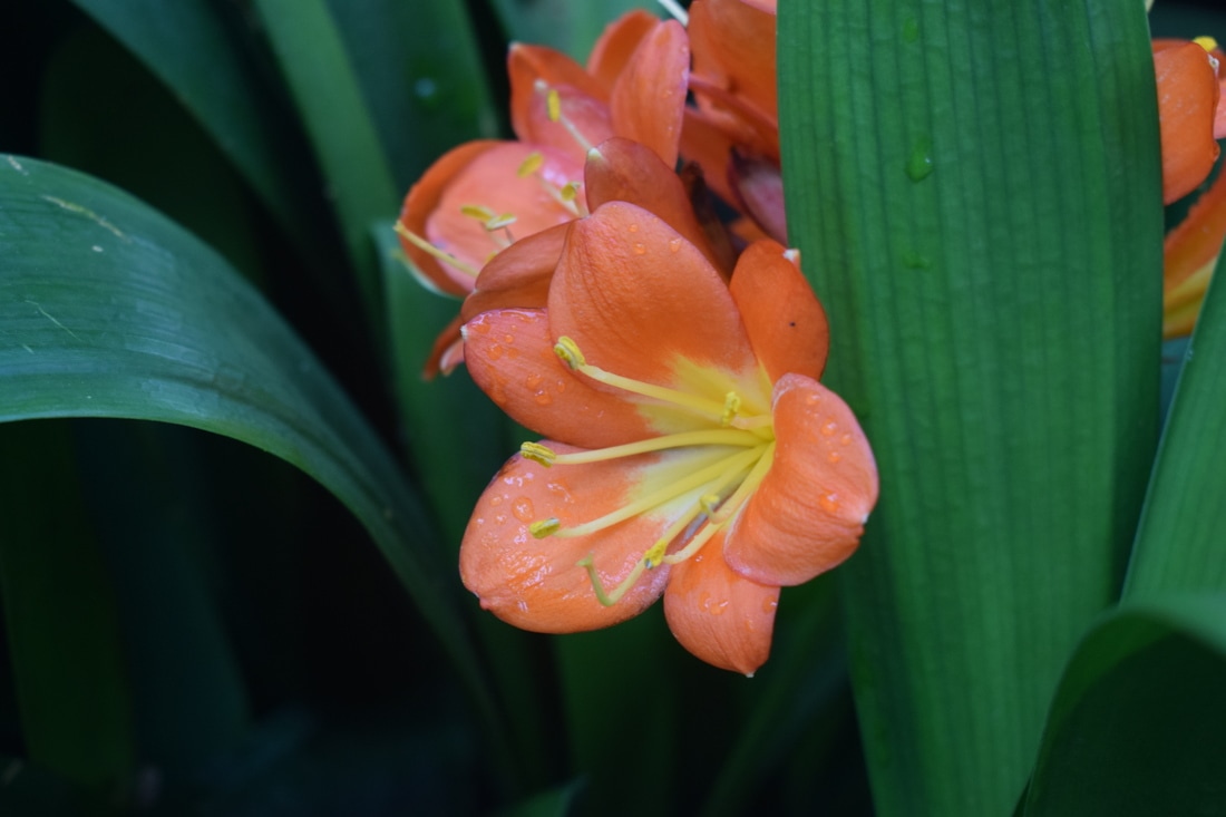
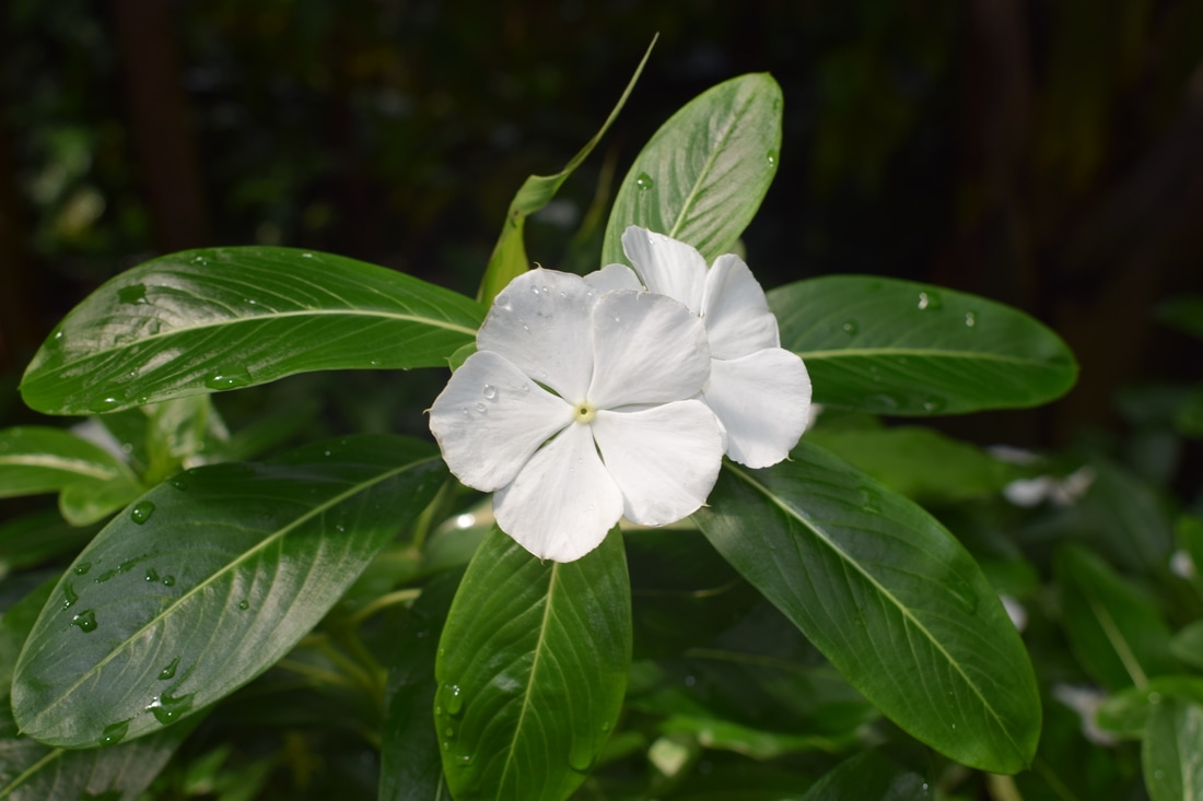
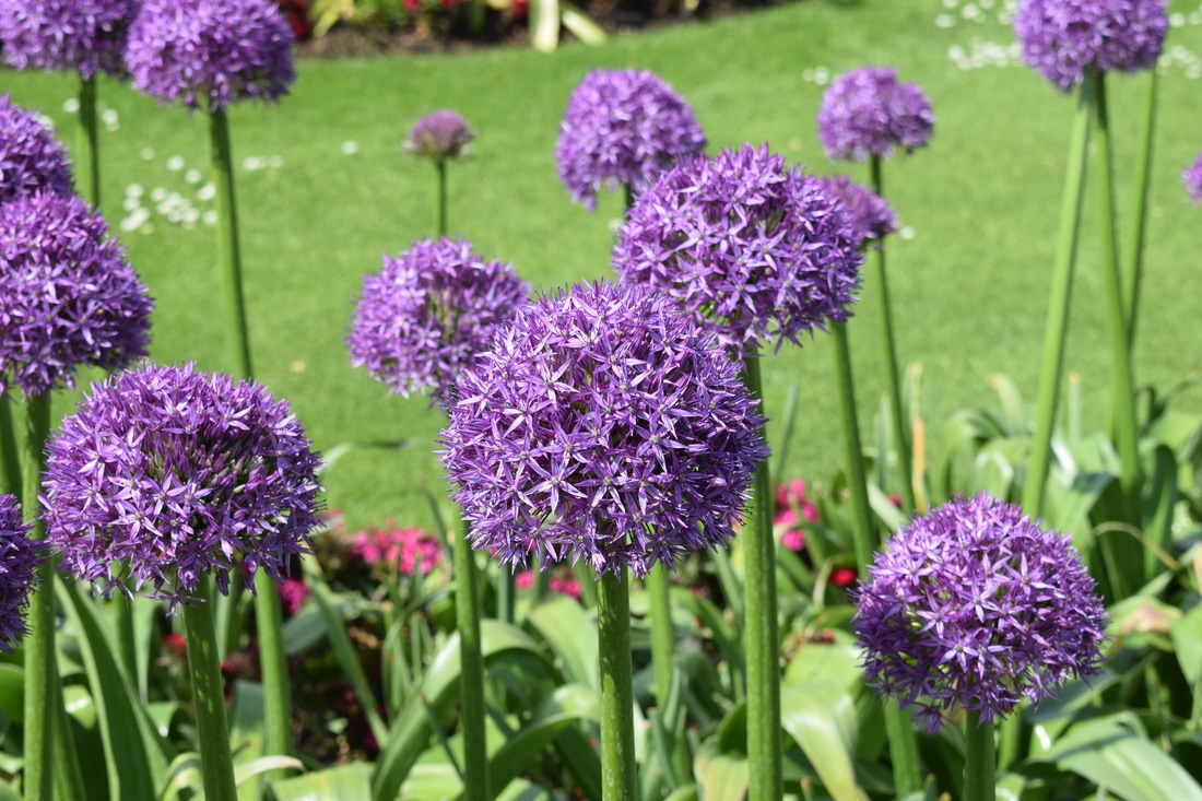
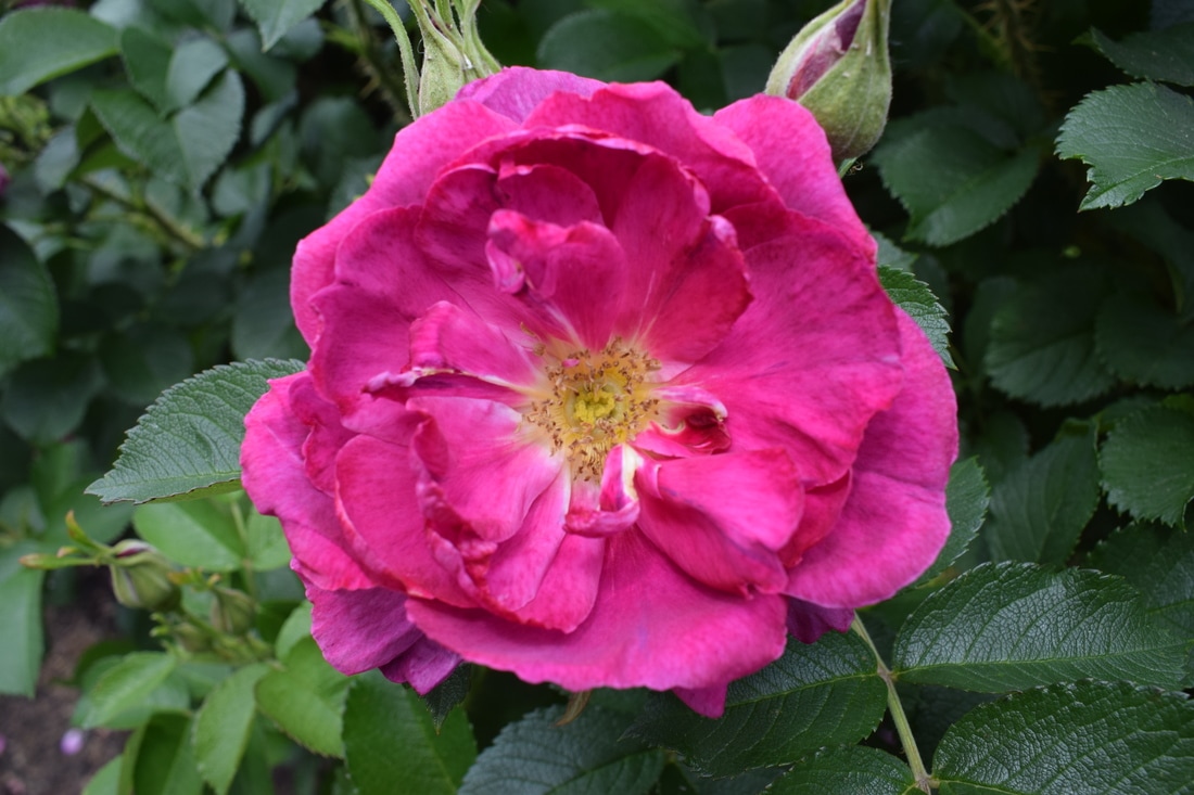
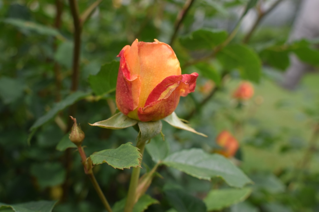
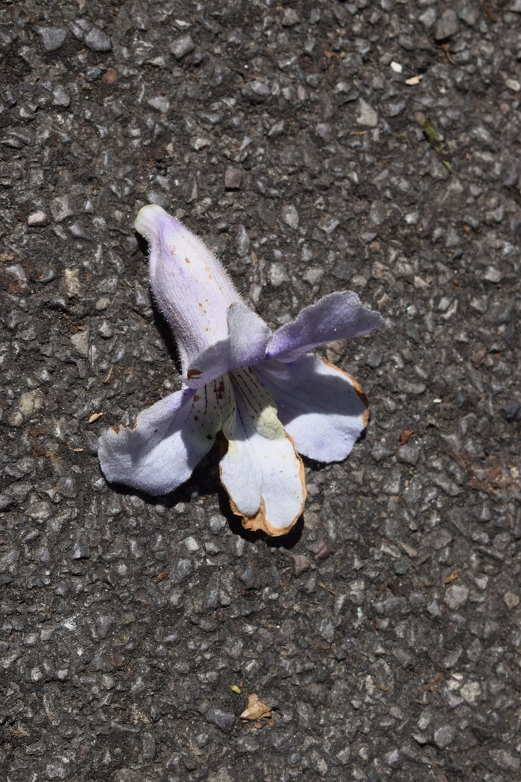
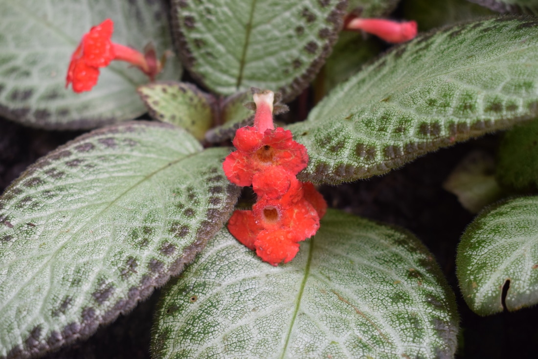
Below are just a selection of unedited photographs that I captured whilst at Kew Gardens. I will be working from and using these, and other images of my own to work from further on it the project.
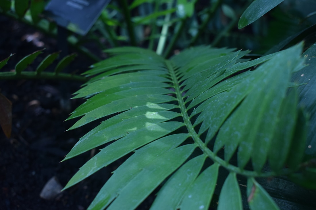
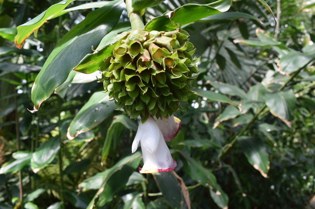
I did a lot of first hand drawing and painting whilst on my trip to Kew. I found that this made the experience of drawing a natural form totally different to simply working from a photograph. You have to cope with changing weather, wind, changing light conditions and drawing in awkward positions. However, I feel like this has helped my technique and is something that I should try to do / practise more often.
As well as taking more own photographs whilst on this trip, I also picked up many postcards. I wanted to get a sense of many different styles and forms of botanical illustrations and by doing it this way I can always have some sort of reference to refer back to.
As well as taking more own photographs whilst on this trip, I also picked up many postcards. I wanted to get a sense of many different styles and forms of botanical illustrations and by doing it this way I can always have some sort of reference to refer back to.
|
I decided that I wanted to focus more on the composition side of botanical illustration for a while as I feel that this plays a major part in these types of illustration. I began taking single petals and playing about with how I could lay them out on a page. Doing this, I began to create paisley-like patterns. This lead me to begin to create patterns using the drawings that I had already made on photoshop through scanning them in.
|
|
