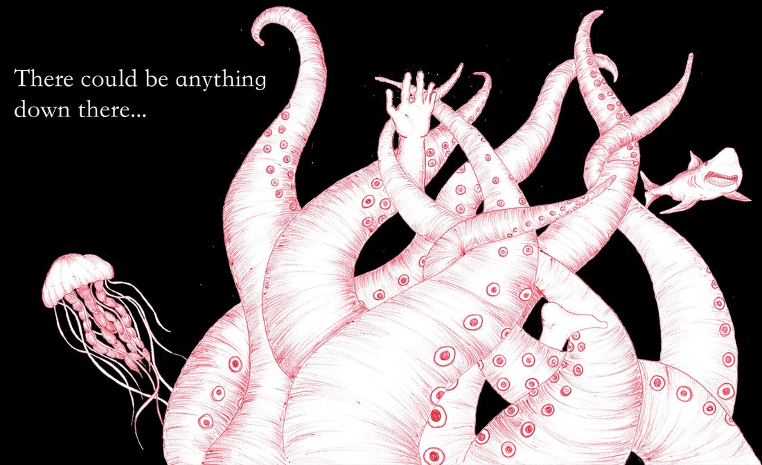
 This brief for this project was much more formal than some of the others that we had been given before. As a commercial brief, we had to make sure we payed attention to exactly what was wanted from the client and that we delivered an outcome on time. To begin, I made two lists; one of things I love and one consisting of things that I hate. Surprisingly, I found it much harder than I originally thought to collect these two lists as it was only when I really put some thought into how strong these words actually are that I realised that there were many things things that didn't fit into either category. My 'love' list consisted of elements such as Nutella, clean bedding, breath taking views and hot chocolate whilst my 'hate' list was made up of things such as fish, bad dreams, coffee and cold tea. Because each list consisted of 10 or more items, I then made a new, more concise list for each which had 3 themes. Love: - Natural wonders (mountains, rivers, lakes, landscapes) - The nights sky (darkness, stars, the moon, shooting stars) - Surfing (the adrenaline rush, clean waves etc) Hate: - The Sea (the unknown beneath the waves) - Hot drinks turning cold - Being Injured For each of these categories, I went on to draw 10 left handed sketches of ideas of elements and compositions to get and begin to evolve any ideas I had. Because these were left handed drawings, I wasn't so worried about the quality of the drawing but more focused on the content and getting the specific idea down onto paper. Having drawn these 60 examples, I decided on one category to use for the brief. I found that whilst the 60 sketches were time consuming, they were definitely a major factor in helping me to decide on the theme that I wanted to use. In future, I think that I'll use this technique to kick start ideas and help me to make quicker decisions about my work. I decided to chose 'I hate the sea' as my theme to respond to the brief. I decided on this because; firstly, I feel very passionately about the subject and therefore have a fair amount of ammunition to create work from and secondly, I found that when creating the 10 sketches for this theme I had the most ideas for this one and enjoyed creating them. Having settled on this theme, I began researching and creating imagery that I could use and work with when making the responses to the brief. I found that doing this early on in the project really helped the creation and evolution of ideas later on. I then turned the rough sketches and drawings into more finalised looking drawings which I then scanned into Photoshop. Taking into account the different dimensions which were specified within the brief, I then began to play about with different compositions which involved using and moving the different components of my design. I learnt how to use layers in photoshop which helped me to keep different parts of the image separate. I also put my basic (and limited) knowledge of photoshopto the test as I experiments with elements such as the opacity and colours. I also had to chose a 'tag line' and decide how this could fit in with each composition. I decided to take influence from horror films and the such to creat a feeling of uneasiness and dread. 'There could be anything down there...' . I then also needed to pick a typeface which would add to the communication of the the theme. I decided on the typeface Kaiti SC Regular as it reminded me of the text used in old fashion horror story books and whilst it is simple and clear to read it creates a sense of forboding.
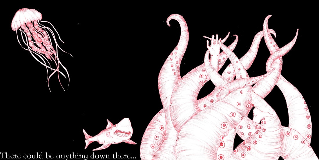  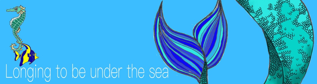 Out of the five images that I have created for this part of the Love or Hate project, I feel that the most successful composition is the image positioned directly above this text. Due to the difference in the size of the different elements of the image (for example, the jelly fish in comparision to the size of the tentacles) which enforces the ominous feeling of dread when thinking about what lies beneath the surface of the water. I think that in terms of which composition needs the most improvement, the second image from the bottom of this set of 'hate' images could be worked on. The text doesn't look as if it 'fits' in the bottom left hand corner, in addition to the, the proportions of the jelly fish is considerably bigger than the tentacles and the shark which i feel degrades the 'scariness' of the contents. However, overall I do like the combination of the hand drawn Images with the use of photoshops as it keeps a feeling of humainty and keeps it feeling quite personal whilst still getting the effects of digital elements. Having finished this part of the brief, we were the given part 2. This instructed us to repeat the task with the same chosen theme however this time we were to do it from the 'love' point of view rather than the 'hate' as before. At first I found this concept rather difficult as we had chosen our subjects as things that we felt passionatley towards and therefore turning the outlook on its head felt quite un-nerving. However, due to the short time scale to complete the task this helped me to quickly change my mindset as to get as much work done as possible and to the best of my ability as knowing that I couldn't afford to simply think about what I wanted to do for a long time forced me to produce work. To restart the project I began the same way as I did before, by producing 10 left handed sketches of possible ideas for outcomes, their elements and compositions. Again, I found this a productive way to produce ideas quickly and without too much thought. Not worrying about the appearance of what each image looked due to them all being left handed drawings like also helped with this. I had already decided that I wanted to keep certain elements of the first part of the project that worked well as I wanted to see how I could transfer different skills into different parts of the project. So, having chosen my favourite composition/design to turn the project into 'I love the Sea' I began to sketch different elements into my sketch book. I kept them as simple line drawings as I was planning on using a similar combination of hand drawn components and digital like the first part of the project. However, unlike the 'hate' project, I decided very early on that I needed these images to be much more dense and colourful in comparision to the minimal colour palette that i used previously. I spent a lot of time scanning in different drawings that I had made and then digitally colouring them in using photoshop making sure that each element was on its own layer so that they could be easily moved and manipulated as well as being moved between different compositions. Unlike the hate project where I drew images of things that are generally feared or seen as dangerous, for part 2, I took inspiration from films such as 'Finding Nemo' and 'The Little Mermaid' to help create a more magical and friendlier looking approach to the design. When thinking about the tag line for this, I again thought about how through film and tv everything is usually lightened through the use of song and rhyme and I therefore thought that this could be a detail I could adapt for it. I feel that the tagline 'Longing to be under the sea' creates a sense of wishfulness towards what it is communicating to the viewer. In terms of the types face for the 'love' part of the project, here I decided on using PingFang SC Thin as it is similar to the 'clean' looking typefaces that you often find used to advertise holidays and travel. 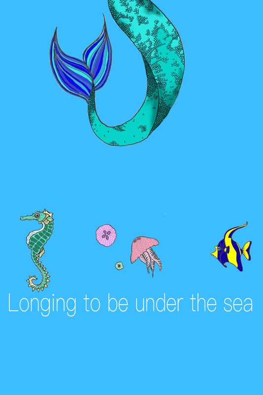 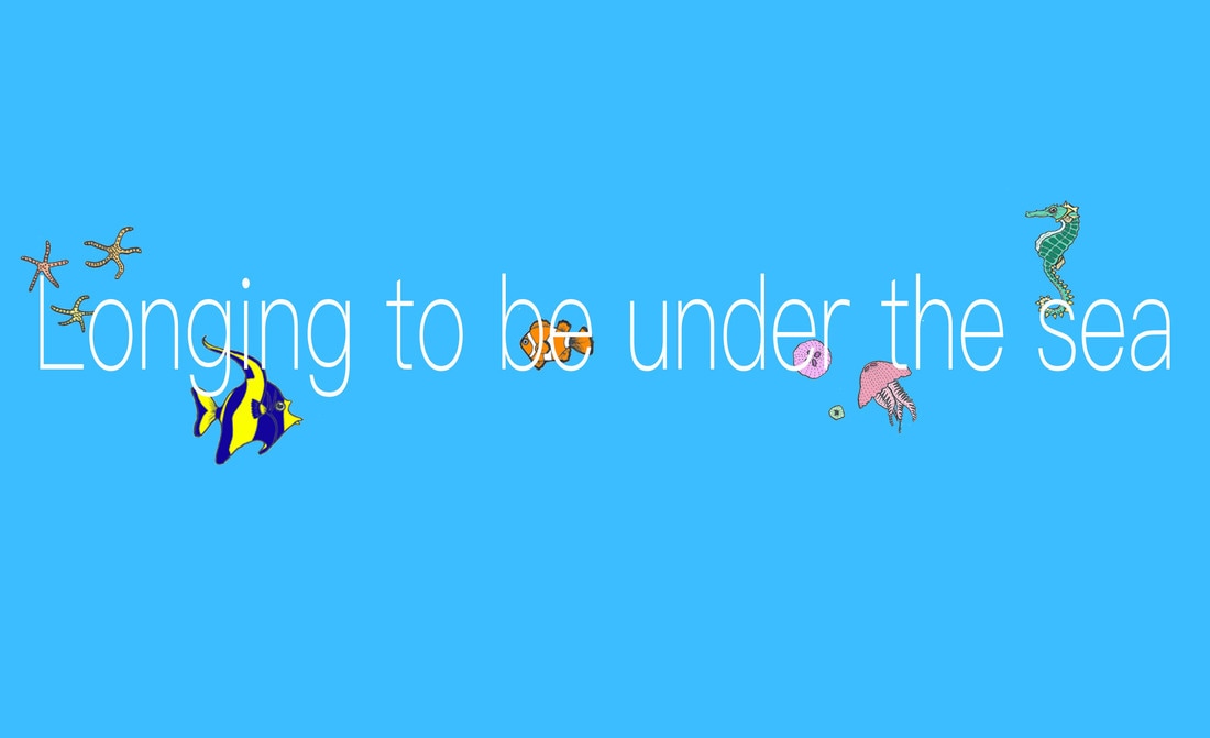  Looking back at these compositions I can see how I was hesitant in changing my ideas too much from the original 'hate' part of the project. I've kept the sparseness of them within part two however, I think that if this set of images looked busier and more full of life and action that it would be more suited to the theme. I could potentially add a more colourful background filled with coral and shipwrecks to add to the fantasy theme. 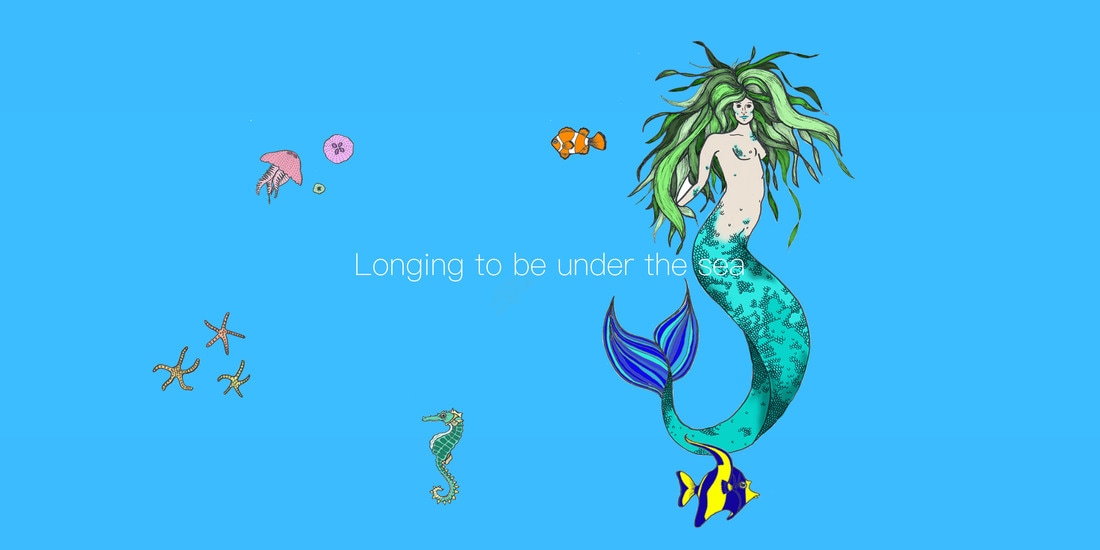
0 Comments
Leave a Reply. |
AuthorChloe Preece, 20 Years old. Illustration student currently studying at the University of Brighton. Archives
December 2016
Categories |

 RSS Feed
