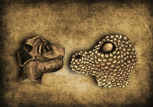
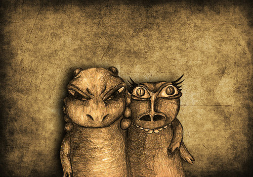
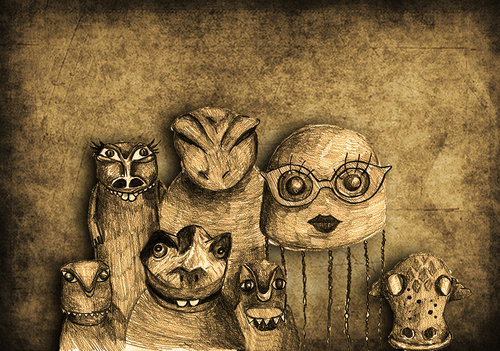
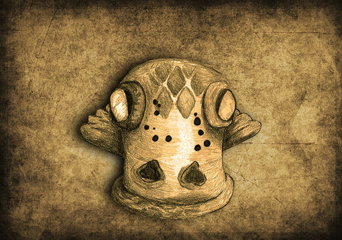
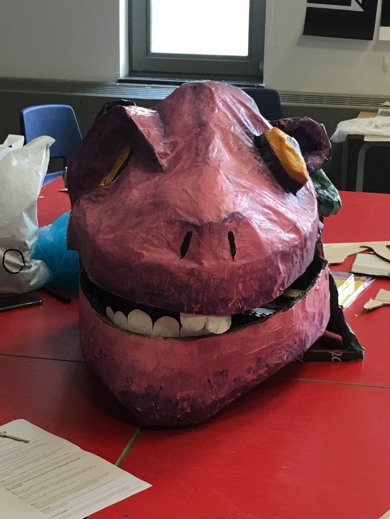
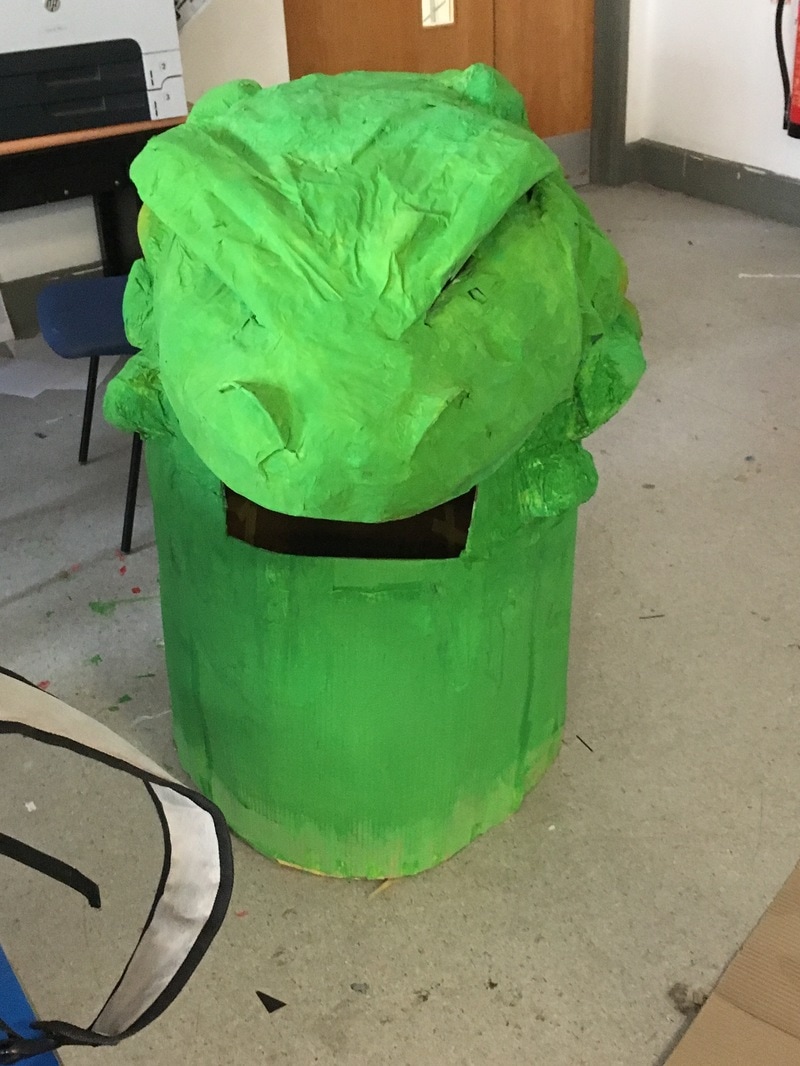
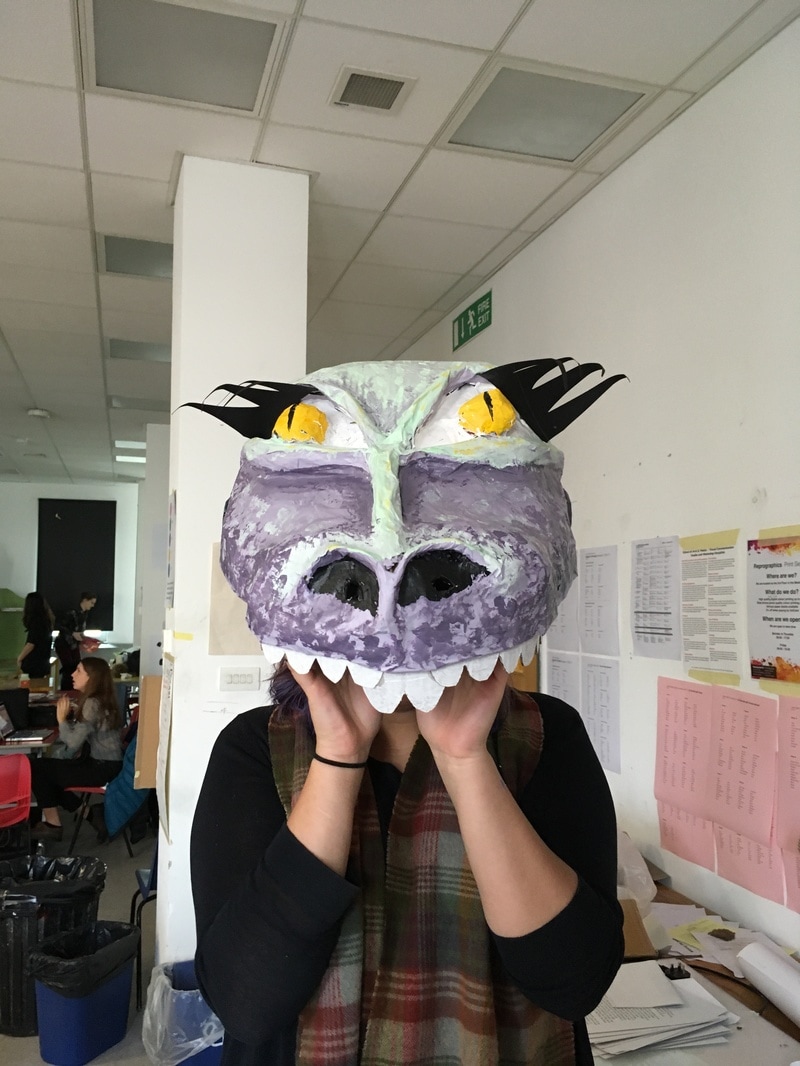
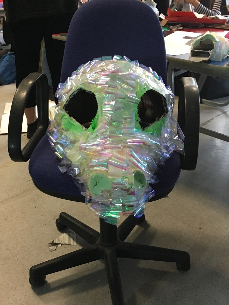
 Written by Italo Calvino, The Aquatic Uncle tells the tale of some of the first fish to make it out of the water onto land and the love affair between a young, rebelious terrestrial being and her fiancees old water loving uncle. We needed to adapt this story so that it could be performed as part of 'Music Tyme' and everyone within 2nd year illustration needed to be involved. We were each asked to produce a 'mood board' of inital thought, ideas and concepts towards the story and how we could invisage different aspeccts of it. I likedthe idea of keeping it as a mysterious prehistoric waterworld where your never quite sure whats lurking around the corner. I researched plants and trees that could have been similar to those that were described within the story whilst I tried to kept the colour palette quite earthy whilst merging in the colours of the water. I also researched the type of animals that the characters were based on and how these looked, or how similar they would have looked to some of the reptiles and ifsh that we have on earth today. I became part of the script writing team. We very quickly learnt that this was an integral part of the first stages of the production as everyone was relying on us for information such as how many characters there were, who they were and about where the different scenes were set. It was quite a challenge for every team to begin at the exact same time before we had written the script however, this pressure helped us to quickly come up with a plan and get the main deatails to everyone who needed them. Whilst during the first day or so there was some confusion about how we were splitting the production up (i.e in two halves, land and sea or just all working together)this soon solved itself and we were able to progress quickly. It was also the script teams job to communicate with all of the ther groups such as the set designers, costume designers and music & visuals to make sure that everyone agreed with desicions that we were making and that it fit with what their visions of the production were to the best of our ability. To begin to decide what we wanted and what was needed within the script, we had numerous read throughs of the original story by Italo Calvino. Slowly, we highlighted and marked what we thought was essential, whether this be descriptive text or speech. In addition to this, we also made a list of the characters. This was needed as we were beginning to think about the number of characters and whether or not we needed more, or less. In the end we decided on eight characters, we shortened the names of some for ease of understanding and pronouciation whilst the characters who we invented and were not in the original story were given syllabic sounding names as to fit in. We decided on the following characters and names... Qu Lil Uncle N'ba N'ga Co & Co Mo (Mother) Fa (Father) Grandmother Having identified the key scenes of the production we could then split them between ourselves so that we could look at each one in more specific detail and then eventually get onto writing the first few drafts of the script. We had seven key scenes, some of which were then split into subsections (a,b,c...) so that we could tackle it in decent sized chunks. I was assigned scene 4; this is the crux of the story where Lil met Uncle N'ba N'ga for the very first time. I haven't had any experience in writing in this format before so I had to make a number of drafts before I got onto the most finalised stages. Throughout the writing process I had to converse with the others on the script writing team, particulary those who were writing the scenes before and after my own to try to make it run as smoothly as possible. I also found that I needed to add stage directions to help give the actors an idea of what we had in mind for the production. However, these were only to be used as a guideline as we felt that changes to the stage design, costumes and the preference of the actors could very well change these. Below is one of the more finalised drafts of my scene in the script. Scene 4 Meeting the Fiancée Qfwfq, Lll, Uncle N’ba N’ga (Qfwfq and Lll are standing on the ‘edge’ when Uncle N’ba N’ga appears to ‘pop’ out of the water below them. Qfwfq looks worried and positions himself closer to Lll as he spots his Uncle. Lll doesn’t react, appearing calm and collected.) Uncle: Well, here I am. What’s the trouble? (Uncle N’ga N’ba swims fluidly closer towards the couple appearing to prop himself up against the side of the stage by their feet.) Qfwfq: Well, Uncle, this is… I mean it is a pleasure to introduce you to my future bride. This is Lll. Uncle: Oh is this so? (Lll now positioned slightly behind Qfwfq. She is stood up in an ‘erotic’ looking pose, staring towards the water, specifically focusing on Uncle N’ga N’ba.) Uncle: And so young lady, you’ve come to wet your tail a bit eh? Qfwfq: Uncle! You can’t speak to her that way! You’re not living in the Devonian period now! Uncle: Don’t be silly Qfwfq, so girl?... (Lll peers around Qfwfq and kneels down to talk to Uncle N’ga N’ba) Lll: Can you tell me something? Uncle: Spit it out. Lll: Those little plants over there…where do they put down their roots? Uncle: Why my dear, those are floating trees! Have never seen such a thing?! They are the best place for hunting, there’s no where like that up there on land I can tell you for sure! You can swim amongst them; they’d never even see you coming… Lll: Oh how interesting! (Qfwfq puts both hands on his head, ashamed and embarrassed he tries to pull Lll away from the waters edge and consequently Uncle N’ga N’ba) Uncle: And I’m not fooling! The amount of worms you’ll find there; you’ll never go hungry again! You can fill your belly alright! (Uncle N’ga N’ba leaps into the air then smoothly head first into the water, flicking his large tail behind him. He picks up a number of worms from the floor then elegantly appears back at the surface, tossing a worm to Lll which she catches and throws into her mouth and another to Qfwfq which he drops with disgust.) Qfwfq: (Turning hastily to Lll) Lll, you’ll have to excuse my Uncle… (Uncle N’ga N’ba interrupts Qfwfq) Uncle: You know as well as I do boy that one day you’ll all return to the water. The climate will burn you up, the land will disappear and only those who admit they were wrong and swim again will survive. Qfwfq: Uncle how could you! Those who have always lived on land are perfect in every way, they will live through the weather and inhabit the earth until the end of time! You can’t be stuck in your ways forever you know! Lll: Q, but what if you Uncle is right about everything? Qfwfq: He’s not. Uncle: Your Lll can tell that I’m speaking sense, why can’t you fool?! Down here…Down here you can have as much space as you want. You don’t have to worry about whether the heat is blistering or freezing and best of all you’ll never go hungry! Qfwfq: But now we gallop over valleys and mountains, Uncle! (Lll remains silent, but continues to stare towards Uncle N’ga N’ba) Uncle: Go on with you, tadpole, when you’re wet again, that’s when you’ll be back home. Qfwfq: The water isn’t our home Uncle! Lll: Uncle? Don’t you think that if we wanted to learn to breathe underwater, it would be too late? Uncle: If you’re game, sweetie, I can teach you in a minute! (Qfwfq looks at Uncle, then to Lll and back again, he’s shocked at Uncle’s response to Lll’s question) Lll: You could?! Qfwfq: (Taking Lll by the arm) Come on Lll, it’s time we should be heading off. (Qfwfq and Lll walk away from the edge of the water whilst Uncle N’ga N’ba slowly sinks down into the water, still holding his worms from his earlier catch) Lll: (running off stage, shouting over her shoulder) He’s very nice, your Uncle! (Qfwfq stares after Lll who is now off stage.) Qfwfq: (In a weak sounding voice.) Are you joking? (lights fade out to black, Qfwfq looks alone and drops his head) END OF SCENE One of the biggest disagreements and concerns that aroused was about how humourous the production would end up being. Again, this was largely something that my team and I were dealing with as this relied nearly solely on the script. Some people were concerned about how the quality of their worked would be percieved if the production became a comedy and if it involved too much slapstick humour. Others, however, didn't believe that you could have the production without any humour at all due to the nature of the original story. The script team then had to decide how the performance should be percieved; should it be a comedy or should it be completely serious? In the end, we opted to have a balance of humour and seriousness as we wanted everyone's input to have been listened to and we felt that by having a balance of both it could hold the integrity of the characters whilst being able to enjoy it at the same time. 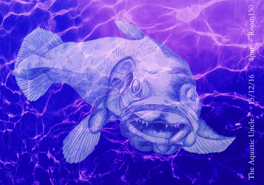 As well as writing the script in the first stages of this project, we were also asked to each design a poster advertising the perfomance. I researched the types of prehistoric fish that the characters were based on and then went onto create a number of sketches experimenting with composition and design. I also wanted to take into account the colour scheme that was being used for the set design and throughout the costumes.
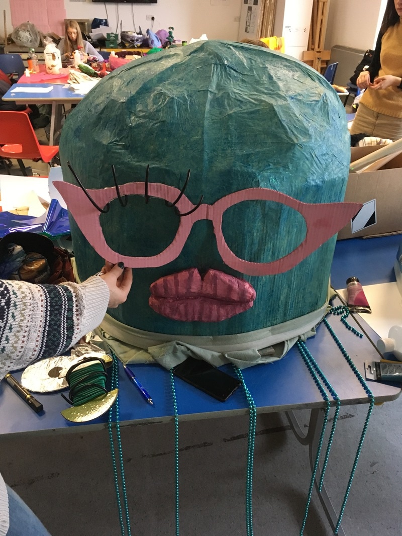
Once we had finished the script and made all of the main adjustments, the script team had to make themselves helpful in other ways mainly through splitting our time between helping directing and helping out the other groups when an extra pair of hands was needed. I found myself particually helping the visuals and lighting teams. They had to create a squence of images for the begininng scene where the characters and their relationships were being introduced. Originally there was going to be a slideshow of photographs using the costumes and actors for this scene however due to timescales, the costumes were not going to be finished in time for the visual team to put together the video so they asked for a set of drawings to take the place of the photographs. 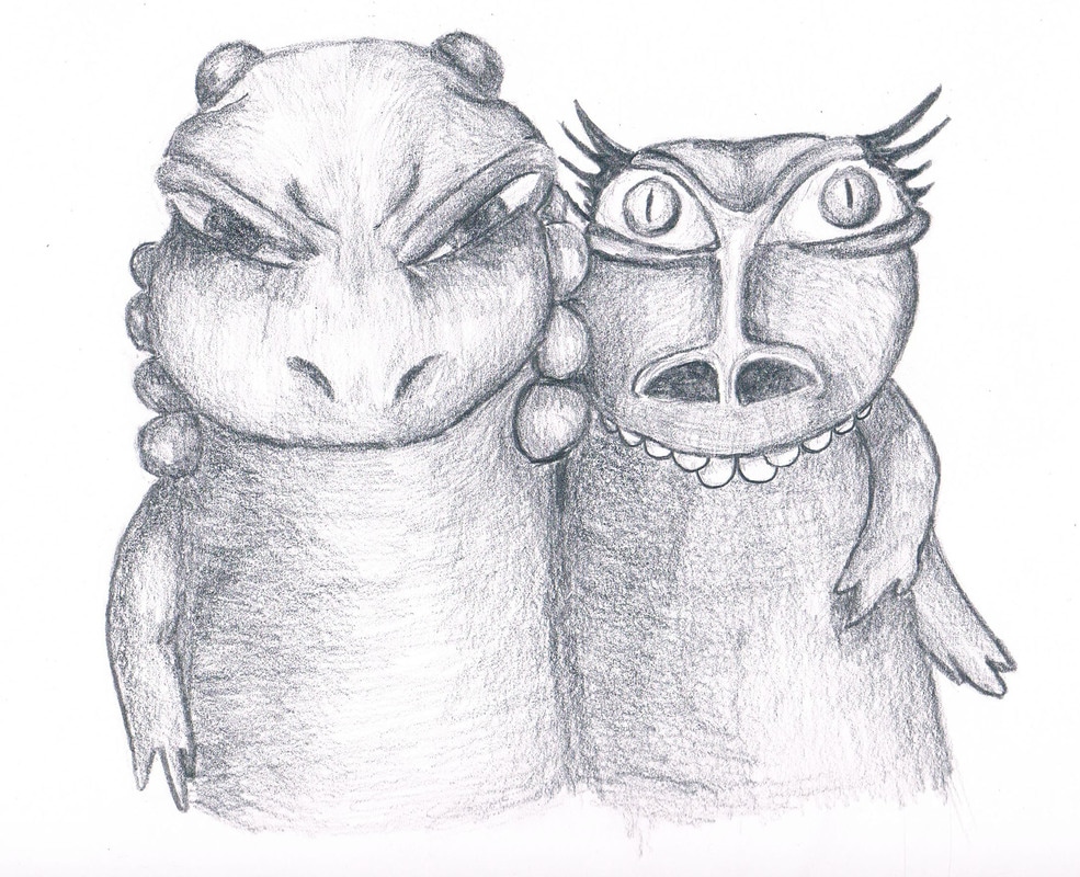 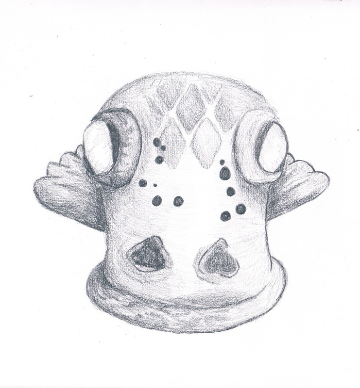 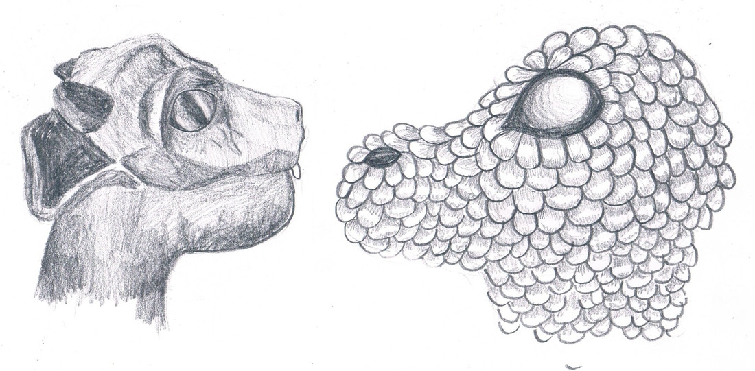 By keeping these drawings tonal, the visual team could then add filters and effects to make them look more like old family photographs (I sent the original drawings to Tash Tully who edited them and these were then turned into a short animation with the sounds effects of an old style projector by Jessica Vogt. The edited images can be seen above). I used the costumes that had been made and partly made as reference so that the audience could directly tell who was who when comparing the on stage characters to the ones seen in these pictures.
Whilst I wasn't able to attend the final Performance due to illness, I have reviewed the footage and images that were taken thoughout it and it seems to have been a success. Having spoken to other members of the course, there were of course a few hiccups and wardrobe malfunctions but that was only to be expected and the actors inparticuarly coped well with simply carrying on. The visual effects team's work was beautiful and it was obvious the amount of time that they had spent working with the set design team to make suring that everything fitted perfectly with the set. The animations that they made fitted well with what the script team had originally invisioned. I admired the effects that were added to my original graphite drawings to give the effect of them being very old family photographs; I feel that they were integrated well and didn't feel out of place in comparison to the rest of the performance.
0 Comments
'Bunraku' is a traditional form of Japanese puppet theatre. It involve lifelike puppets that are usually sized between one and four feet tall that are manipulated by a number of performers; these people are sometimes hidden as was done before the 18th century however, it is much more common now to have these perfomers within the view of the audience. The 'principal' puppets are usually manipulated by three people, each of whom are in charge of either the head, the arms, legs or sometimes combinations of these elements. Having made our own versions of these puppets, I can really admire how much work goes into making the movements of the puppets as life like as possible. It takes a lot of co-ordiation and concentration to not only move your own part(s) of the puppet but to also make sure that it works in time with what the other performers as doing at the same time. We really noticed this when we practised making out puppet walk, and we had to watch and pay attention to how we walked ourselves in order to help us understand how we should move the legs of the puppet to make it as life like as possible.
Japan’s Bunraku Puppet from james n schlefer on Vimeo.
I found the Narratives of the Unconscious project both challenging and enjoyable. I was pushed out of my comfort zone to create a short film, something that I have very little experience in working in as a format before.
To begin generating ideas for this project, we had a day of taking part in a number of different excersises which could help us to visualise different elements that we could potentially use within our films. One of these involved working in pairs; one person would talk about a journey that they were visualising in their heads which was being guided by a tutor whilst the other member of the pair would be drawing what their partner was explaining to them. For this exercise I found that communication was essential especially as I was working with somebody that I was not very familiar with. It was, however, very interest to see the range of outcomes that everyone got from the same 'storyline'. For example, at one point I saw myself in a tipi with a large old woman with extremely long plaited hair whilst my partner when it was her turn, visualised herself within the walls of a larged stone built castle with a man in a flowing black cape. It was also interesting to learn how different parts of the story linked with our conscious and sub-conscious with out us even knowing about it. Another exercise included making a list of qualities that we felt we each had and the visualising this for ourselves. In my case, I was visualising the word 'Carer' and I visualised a rabbit. All of the exersises could be used as starting points for our films which would need to involve using masks or puppets. Later on in the project we had a workshop day where we were taught different techniques in making puppets, performance and making masks.
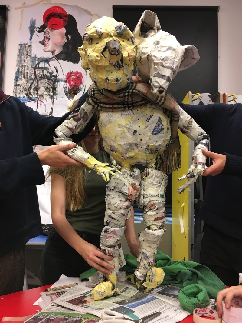
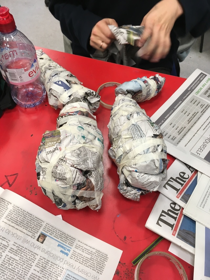
Using just masking tape and newspaper, we worked in teams to create a puppet to be used in the Japanese puppetry form 'Bunraku' which involves three or more people working together to move it. We had to find ways of making joints which moved only in the 'right' life like directions as well as finding how to manipulate the paper to create the shapes we wanted. Our 'Mouse-man' puppet came from a story telling exercise we had done earlier that day so we knew roughly what it was going to be based on. Working out the scale of the puppet was one of the hardest aspects as each team member was working on a different part of the head, body or a limb so we had to constantly communicate and work together to make sure that all the parts were the right size and would fit together well. We found that by only lightly 'scrunching' the newspaper, it became much more malleable and easier to achieve the finish we wanted.
Once we had finished making our puppet, we then learnt how to make it move and walk so that it could be used to act out the story from one of the earlier exercises. We assigned one person to move the heads, one person to move the legs and one person for each arm. I acted as the director and helped to coordinate the movements and found which elements need to be improved and changed. Each group then performed their piece using the puppets and recieved feedback from the other groups. We also filmed our performance so that each member of the group could see how to improve and spot what they were doing individually that could be improved or that was working well. mouse man from Chloe Preece on Vimeo.
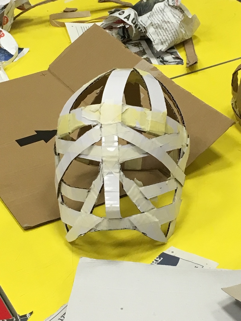
Following on from this, we went on to make masks out of cardboard and tape. These acted as skeletons or like a base so that they could later be built up using paper mache or something similar to create a character. Because we were each making a mask for ourselves, they were made to fit our own faces as the size, shapes and contours would be specific to each individual person however, I later repeated this task to make another mask for the person I had chosen to act in my film so it would fit him properly.
When it came to filming my film, I found it extremely useful to have a rough storyboard with me so I knew what I wanted to film and how it would fit together whilst being able to have the freedom to change ideas and shots if i needed to. The main problem I encountered was that I lost some of the footage from the first half of the film which helped to introduce and explain the story. Because of this and not having enough time to reshoot these scenes, I had to juggle what footage I had left however due to this, the film appears to be a little confusing to the viewer. I am planning on reshooting the film in the near future so that I'll have the scenes i need for the film to make sense but i'll also have a proper costume for the 'Boris' character by this point which will add to the quality of the overall outcome. Generally I'm very happy with this as a first attempt as I haven't made a film such as this before.
Boris and Maud from Chloe Preece on Vimeo. 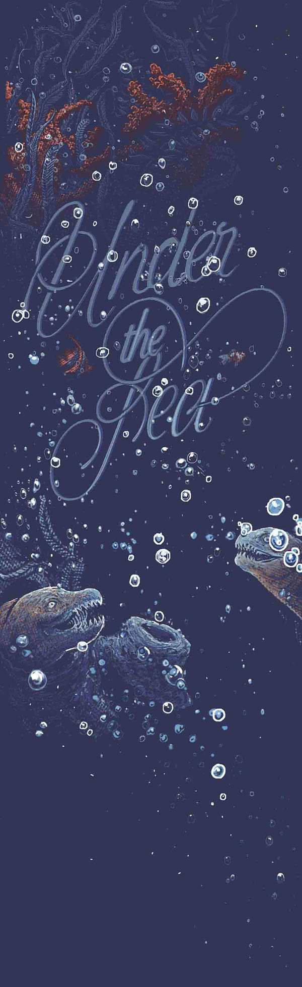 Georges Le Mercenaire's 'Under The Sea' series sparks both fear and curiosity within me. I came across his work when researching for the 'Love or Hate' project, as I was looking at the hating the sea at first I disliked his theme. However, on closer inspection, I admired his subtle use of colour and the contast between the solid, dark background and the more delicate, highlighted figures in the foreground. I can also see how well the typography fits with the image as a whole as well as the theme itself. The typography appears to have been influence by the nautical theme and it flows freely between the drawings themselves as if it was the water that it is supposedly under.
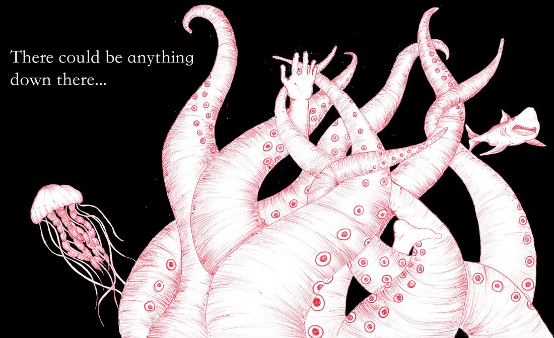
 This brief for this project was much more formal than some of the others that we had been given before. As a commercial brief, we had to make sure we payed attention to exactly what was wanted from the client and that we delivered an outcome on time. To begin, I made two lists; one of things I love and one consisting of things that I hate. Surprisingly, I found it much harder than I originally thought to collect these two lists as it was only when I really put some thought into how strong these words actually are that I realised that there were many things things that didn't fit into either category. My 'love' list consisted of elements such as Nutella, clean bedding, breath taking views and hot chocolate whilst my 'hate' list was made up of things such as fish, bad dreams, coffee and cold tea. Because each list consisted of 10 or more items, I then made a new, more concise list for each which had 3 themes. Love: - Natural wonders (mountains, rivers, lakes, landscapes) - The nights sky (darkness, stars, the moon, shooting stars) - Surfing (the adrenaline rush, clean waves etc) Hate: - The Sea (the unknown beneath the waves) - Hot drinks turning cold - Being Injured For each of these categories, I went on to draw 10 left handed sketches of ideas of elements and compositions to get and begin to evolve any ideas I had. Because these were left handed drawings, I wasn't so worried about the quality of the drawing but more focused on the content and getting the specific idea down onto paper. Having drawn these 60 examples, I decided on one category to use for the brief. I found that whilst the 60 sketches were time consuming, they were definitely a major factor in helping me to decide on the theme that I wanted to use. In future, I think that I'll use this technique to kick start ideas and help me to make quicker decisions about my work. I decided to chose 'I hate the sea' as my theme to respond to the brief. I decided on this because; firstly, I feel very passionately about the subject and therefore have a fair amount of ammunition to create work from and secondly, I found that when creating the 10 sketches for this theme I had the most ideas for this one and enjoyed creating them. Having settled on this theme, I began researching and creating imagery that I could use and work with when making the responses to the brief. I found that doing this early on in the project really helped the creation and evolution of ideas later on. I then turned the rough sketches and drawings into more finalised looking drawings which I then scanned into Photoshop. Taking into account the different dimensions which were specified within the brief, I then began to play about with different compositions which involved using and moving the different components of my design. I learnt how to use layers in photoshop which helped me to keep different parts of the image separate. I also put my basic (and limited) knowledge of photoshopto the test as I experiments with elements such as the opacity and colours. I also had to chose a 'tag line' and decide how this could fit in with each composition. I decided to take influence from horror films and the such to creat a feeling of uneasiness and dread. 'There could be anything down there...' . I then also needed to pick a typeface which would add to the communication of the the theme. I decided on the typeface Kaiti SC Regular as it reminded me of the text used in old fashion horror story books and whilst it is simple and clear to read it creates a sense of forboding.
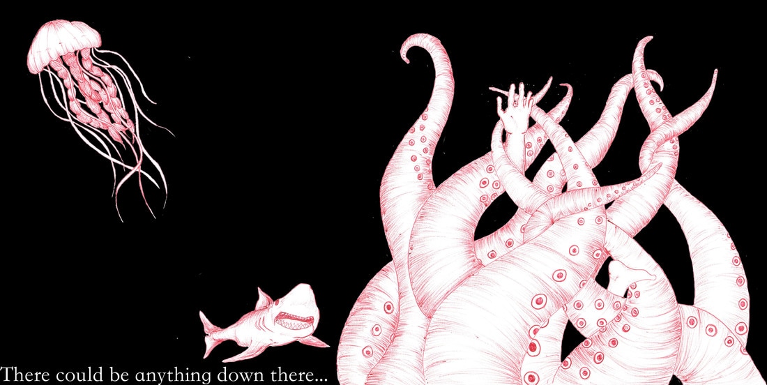  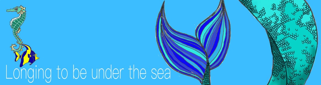 Out of the five images that I have created for this part of the Love or Hate project, I feel that the most successful composition is the image positioned directly above this text. Due to the difference in the size of the different elements of the image (for example, the jelly fish in comparision to the size of the tentacles) which enforces the ominous feeling of dread when thinking about what lies beneath the surface of the water. I think that in terms of which composition needs the most improvement, the second image from the bottom of this set of 'hate' images could be worked on. The text doesn't look as if it 'fits' in the bottom left hand corner, in addition to the, the proportions of the jelly fish is considerably bigger than the tentacles and the shark which i feel degrades the 'scariness' of the contents. However, overall I do like the combination of the hand drawn Images with the use of photoshops as it keeps a feeling of humainty and keeps it feeling quite personal whilst still getting the effects of digital elements. Having finished this part of the brief, we were the given part 2. This instructed us to repeat the task with the same chosen theme however this time we were to do it from the 'love' point of view rather than the 'hate' as before. At first I found this concept rather difficult as we had chosen our subjects as things that we felt passionatley towards and therefore turning the outlook on its head felt quite un-nerving. However, due to the short time scale to complete the task this helped me to quickly change my mindset as to get as much work done as possible and to the best of my ability as knowing that I couldn't afford to simply think about what I wanted to do for a long time forced me to produce work. To restart the project I began the same way as I did before, by producing 10 left handed sketches of possible ideas for outcomes, their elements and compositions. Again, I found this a productive way to produce ideas quickly and without too much thought. Not worrying about the appearance of what each image looked due to them all being left handed drawings like also helped with this. I had already decided that I wanted to keep certain elements of the first part of the project that worked well as I wanted to see how I could transfer different skills into different parts of the project. So, having chosen my favourite composition/design to turn the project into 'I love the Sea' I began to sketch different elements into my sketch book. I kept them as simple line drawings as I was planning on using a similar combination of hand drawn components and digital like the first part of the project. However, unlike the 'hate' project, I decided very early on that I needed these images to be much more dense and colourful in comparision to the minimal colour palette that i used previously. I spent a lot of time scanning in different drawings that I had made and then digitally colouring them in using photoshop making sure that each element was on its own layer so that they could be easily moved and manipulated as well as being moved between different compositions. Unlike the hate project where I drew images of things that are generally feared or seen as dangerous, for part 2, I took inspiration from films such as 'Finding Nemo' and 'The Little Mermaid' to help create a more magical and friendlier looking approach to the design. When thinking about the tag line for this, I again thought about how through film and tv everything is usually lightened through the use of song and rhyme and I therefore thought that this could be a detail I could adapt for it. I feel that the tagline 'Longing to be under the sea' creates a sense of wishfulness towards what it is communicating to the viewer. In terms of the types face for the 'love' part of the project, here I decided on using PingFang SC Thin as it is similar to the 'clean' looking typefaces that you often find used to advertise holidays and travel. 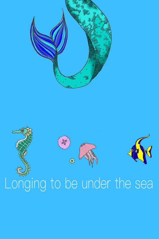 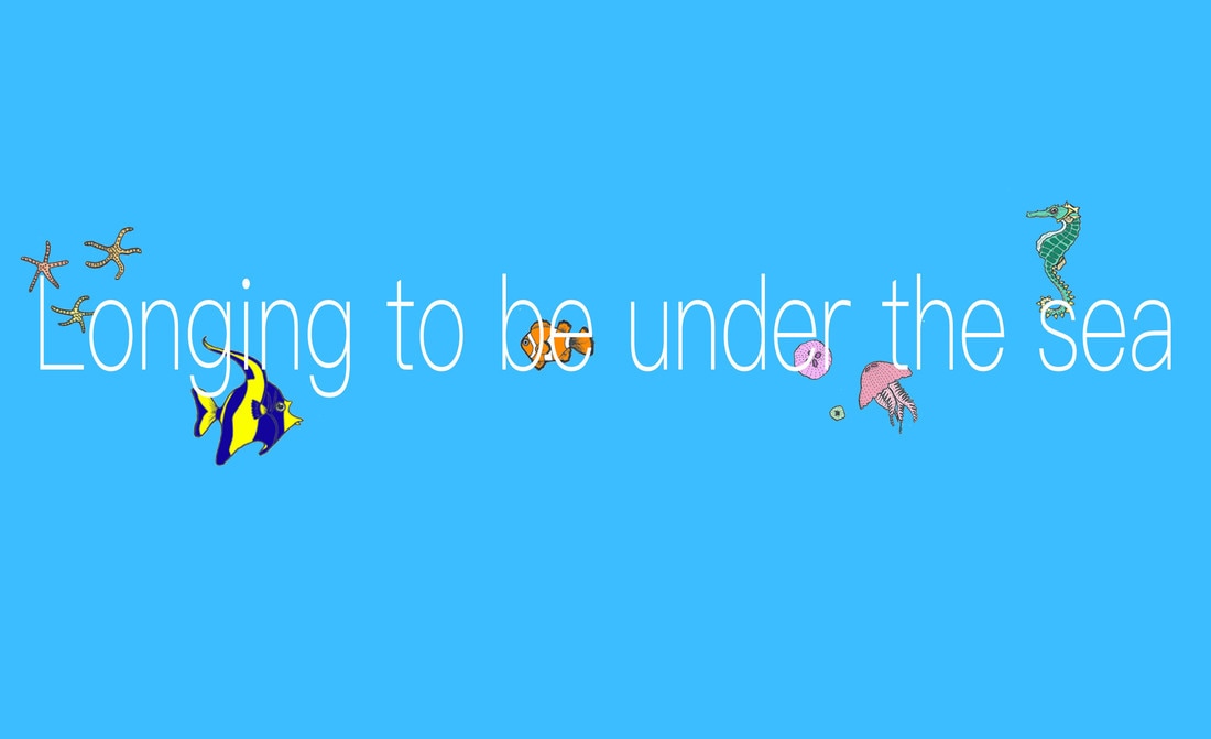  Looking back at these compositions I can see how I was hesitant in changing my ideas too much from the original 'hate' part of the project. I've kept the sparseness of them within part two however, I think that if this set of images looked busier and more full of life and action that it would be more suited to the theme. I could potentially add a more colourful background filled with coral and shipwrecks to add to the fantasy theme. 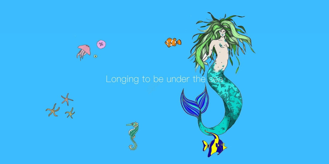 The Youtube creator Hombre_McSteez uses sheets of acetate as frames for his animation allowing him to combine the real world and his imagination. I like this combination as whilst there is a clear difference between what is real and what is not with in the animation, you almost begin to believe that the characters come to life along with the inanimate objects from the 'real' world that the creator has animated and given expressions. I'd like to find a way of bringing this sort of contrast into my own work as I think it can help to add humour as well as a narrative to the work.
I had some technical problems with the QR codes that I had made previously timing out and it seems that the website I had made them through has deleted them. I have made the above as quick mock ups of what my original gifs looked like however, these are simply Jpegs as I was't sure if it was going to work again. Below is an image of how the Qr codes code potentially be used. Although, there would very likely be more distance between the 'hazard' and the code itself to give the user time react to it.  These are a number of QR codes that I created for this project, their aim is to warn the use of an imminent danger or hazard. They use a range of audio clips, GIFs and still images to convey this. I think that the most effective QR codes are the ones which had only the still jpeg images as they had to be consise and to the point to get the message communicated to the viewer as quickly as possibly. I had the most trouble trying to make the GIFs and whilst i like the outcomes of them, I feel like they could have simply been summed up in one image which would be a much better way of visually communicating a warning.
I originally It is at this point that I have begun to encounter some problems with the design and concept of my ideas for this project. I started making up some mock QR codes so that I could investigate how they worked and how I could use them within the project. I found that with my original idea of having them on the floor to casually walk past and pick up would have a number of issues. Firstly, you'd have to have the QR code reading app open to be able to scan the code; this means that the idea of being able to 'scare' the user into looking up with, for example, a sound effect or recording wouldn't work as the user would be expecting something to happen as they were reading the code. Secondly, on the trails i found that feet often get in the way of the camera being able to pick up the QR code, therefore unless the user was purposely searching and scanning the codes it could be easily missed. And finally, in terms of the concept of the idea, I originally wanted to make people look up from their phones and media devices to take more notice of the world around them. However, making the user, use their phone in order to pick up a QR code which would then (hopefully) make them look up from their device seems to be defeating the objective; almost encouraging the continual use of the device which is rather ironic. And yet considering this, I feel that this could potentially be used to an advantage. Having a QR code trail that warns you of dangers (whether they should be considered one or not) and encourages the discouraging of encouraging the continual use of mobile devices on its own app has a certain ironic appeal which could potentially be quite amusing, for both the user and those around them. 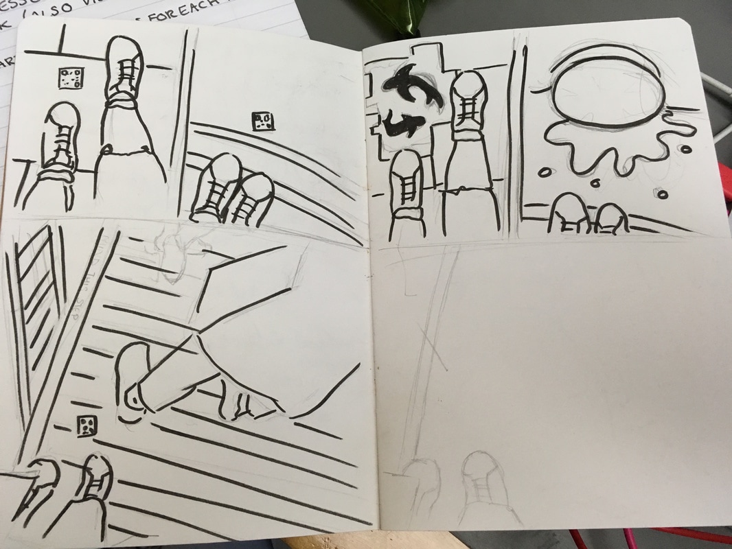 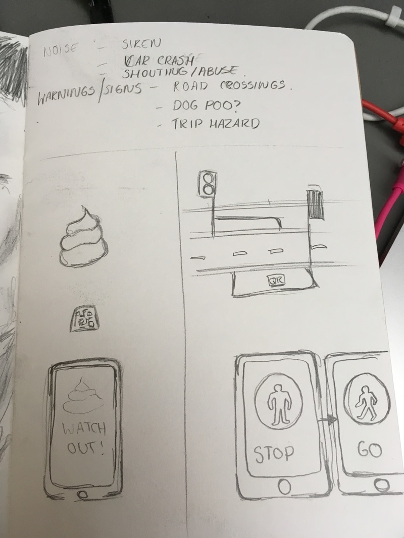 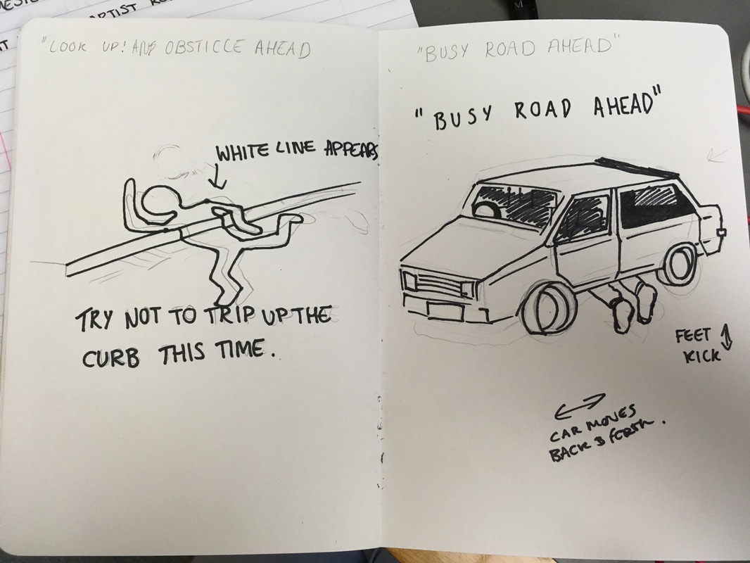 The images above show some initial ideas I have in my sketchbook about concepts and how potential images and GIFs could possibly look if they were to be used with a QR code in this situation.
Making the Invisible, Visible. Part one.
Initially for this project I had no idea in which direction to take it. I began By walking around the local area within Brighton trying to adopt some kind of narrative of which I was yet to figure out. By taking photographs of my journey, I found that I was continually looking down at my phone which made me become more aware of how many people I had walked past that had also been looking at their devices rather than where they were going. Whilst concentrating on documenting my journey through taking pictures of my feet, I walked into a lamp post which consequently sparked the question, 'Why didn't anyone warn me?'. For my interactive QR codes, my current frame work involves Having QR code warnings on the floor to warn any unaware users (who are completely dissolved into their devices) or any 'inspecting dangers lurking ahead so that they can do their best to avoid them. The things that could be integrated include warnings about; road crossings, oncoming traffic, trip hazards, trees, lamp posts, litter, dog mess and crowds of people. I have thought about multiple ways of using the QR codes as warnings. At first I was prepared to make audio recordings of sirens, car horns, shouting or car crashes that could potentially shock the person using the QR codes into looking up from their device into the world around them. After this I thought about warning signs, similar to those you see every day (i.e. wet floor signs) that could warn you about things that you would either not have even thought about or things you shouldn't have to be warned about. Continuing on from this, I have been looking at making short GIFs which could add more of a narrative to the general idea of this project. |
AuthorChloe Preece, 20 Years old. Illustration student currently studying at the University of Brighton. Archives
December 2016
Categories |


 RSS Feed
